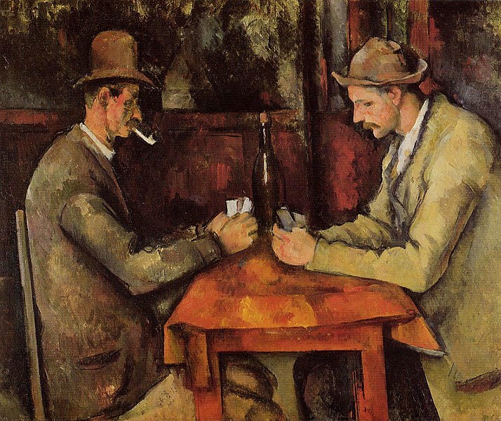
Over the past few months, in preparation for our Book of Eniarof crowdfunding campaign, we have been exploring the use of playing cards as a method for designing and developing games, concepts, attractions, and playful art objects of various ilk.
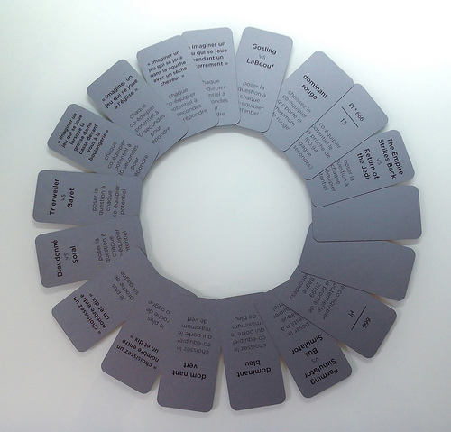
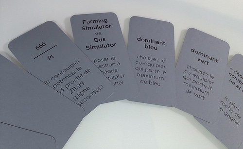
There is a curious sub-history of the use of playing cards in artistic production; it is one of the more interesting of the obscure subjects of art, but can also become the objet d'art itself (play as œuvre).
For example, in 1941, while housed in a villa in Marseille and awaiting passage to the United States via the Emergency Rescue Committee, a group of surrealists — among them André Breton, Max Ernst, Wilfredo Lam, and André Masson —, created one of the best known artistic collections of playing cards: Le jeu de Marseille. Le jeu de Marseille invents a sort of psychic iconography, using images such as keys and fire instead of the diamonds or hearts of the more traditional decks of playing cards. These surrealist cards replaced the traditional kings, queens and so forth, with less ennobled and more mythical literary figures such as Lautréamont, Freud, Baudelaire, and the inimitable Ubu Roi who becomes, almost inevitably, the Joker. As a means of representation, these cards can be considered something like another canvas for art.

But just as importantly as cards containing artistic iconography, playing cards have also played an interesting role in the production of art. There are many examples of both the direct and indirect use of playing cards, tarot cards, or flash cards, in the production methodologies of important artists such as John Cage (cf. 4’33”), or in the Fluxkits produced and designed by George Macunias, such as George Brecht's Water Yam.
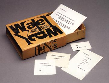
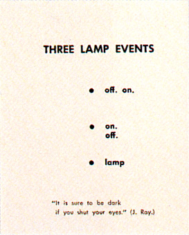
For it is with Water Yam that playing cards take on a truly active, even generative role in the production of art. Each flash card contains instructions for an in-situ performance: the artist/performer chooses a card, such as “Three lamp events: off on, on off, lamp”, invents an interpretation of this instruction, and performs it. These randomly chosen instructions guide the artist in the selection of some of the most fundamental ingredients of art, such as the materials, the context and even the temporality of a work of art. Once these fundamentals have been chosen for the artist, the latter is left with combining these ingredients into a form that will produce the actualised work of art.
We could also mention Brian Eno's popular Oblique Strategies which has gone through many iterations, all of which revolve around a series of cards chosen at random, each offering a sort of aphorism on how to best advance in any artistic endeavour.
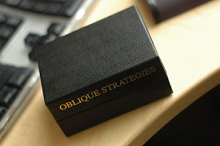
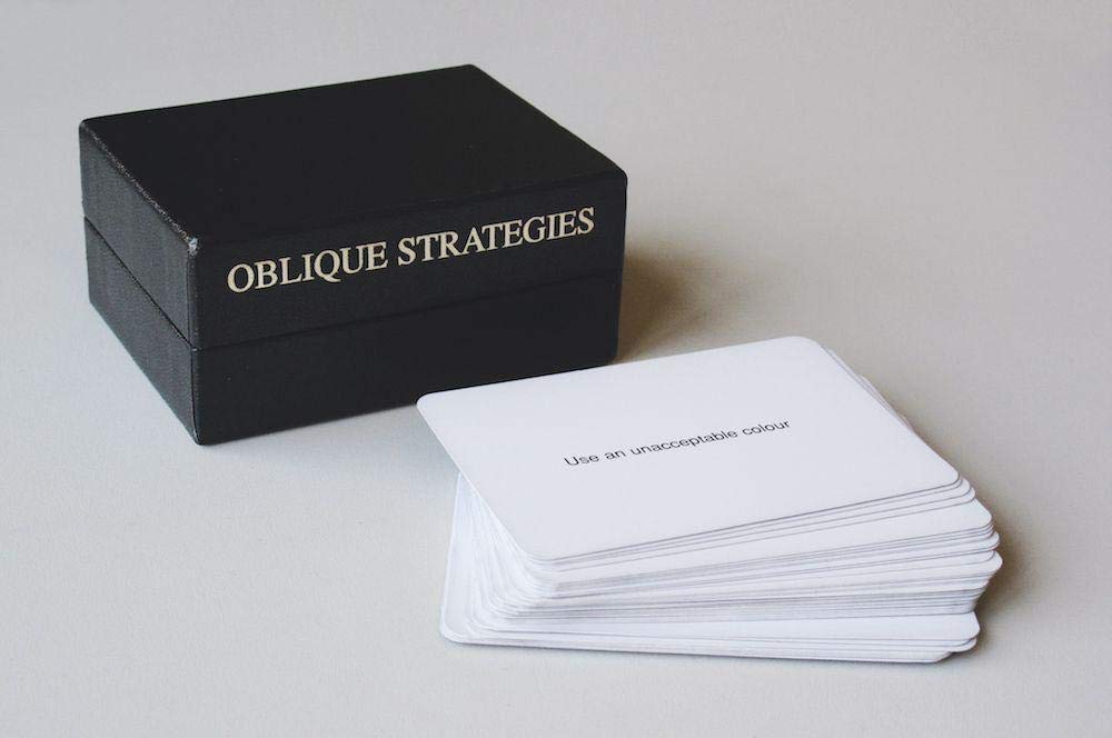
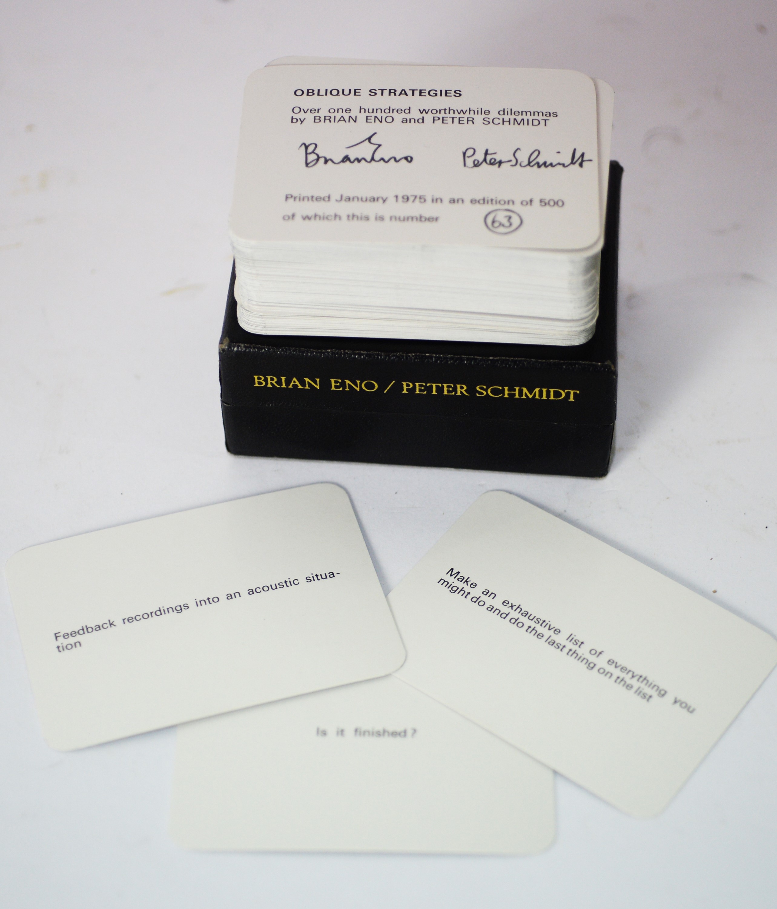
So it is within this rich historical context that we have been playing cards, playing with cards, and designing playing cards for the express purpose of transforming our ongoing series of ENIAROF workshops and festivals into zones for play. But our playground is intended as much for the players as for the artists at work, i.e. for those who are designing and building the grounds for play.
While it is not really our goal here to define what is ENIAROF, suffice it to say that ENIAROF is a mobile festival in which artists, designers and performers of various ilk meet for approximately three weeks to build (from scratch) a temporary autonomous zone dedicated to play. Physical play, social play, video games, electronic games, playful installations and playful transgressions are mixed in with musical performances, beer, sausages, crêpes and okonomiyaki. Taken as a whole, ENIAROF is a sort of undefined electrified freak show, a kaiju algorithmic art monster of unknown proportions that gleefully refuses to define itself. We often simply say: that-thing-otherwise-known-as-ENIAROF.


But behind the scenes, with now over fourteen editions of ENIAROF behind us, we have nevertheless begun to understand how an ENIAROF should work, and most importantly, how to build one. And of all the ingredients that we have come to rely on in the workshop phase of ENIAROF, one of the more interesting — and recent —, tools is the deck of playing cards.
I should immediately insist that we have not finalised the form or even the nature of these cards, and it will only be once we have finished the Book of Eniarof crowdfunding campaign — and the book itself —, that we will know what sort of cards we want to create. Nevertheless, we already know from experience that these cards will interact significantly with the DIY instructions of the Book of Eniarof, and that these cards will be used by workshop participants as a form of creation-within-constraints, i.e. as a means of transforming work into play.
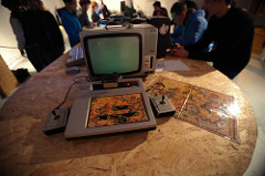
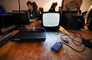
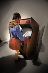
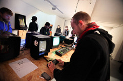
For example, in October 2013, in preparation for ENIAROF#13 of the Marseille Provence European Cultural Capital 2013, students of the Media Design Master of the Haute École d’Art et de Design –Genève were invited to design a « Retrocompatible Museum », instead of the more traditional form of a video arcade. Ever since the first edition of ENIAROF in 2005, one of the constants of ENIAROF has been its video arcade. In fact, ENIAROF more or less evolved out of a desire to expand the scope of interactive Hypermedia-based art beyond the somewhat staid digital art exhibitions of its time, but was equally designed as a critique of the sad contemporary state of fairs, carnavals, playgrounds and arcades. So in 2013, when it came time to design the largest ENIAROF to date, we thought it appropriate to build a more ambitious arcade and to give it something of an historical slant. This was our humble attempt at redefining the expanding field of historical retrogaming exhibitions, some of which go painfully out of their way to take all of the fun out of gaming.
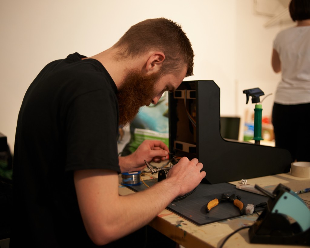
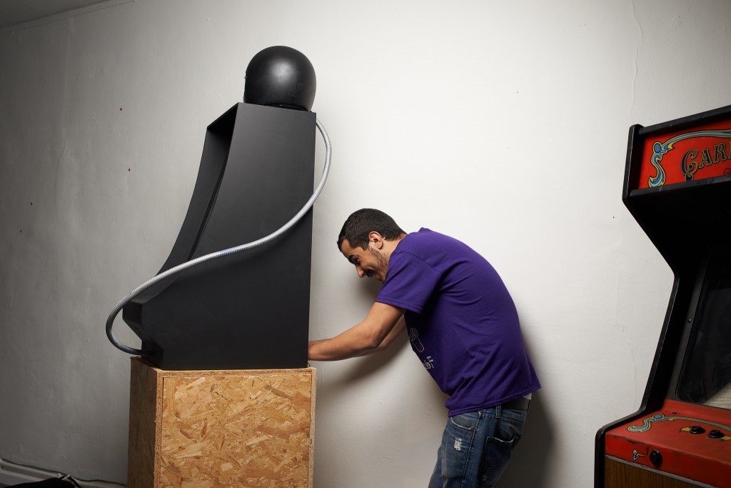
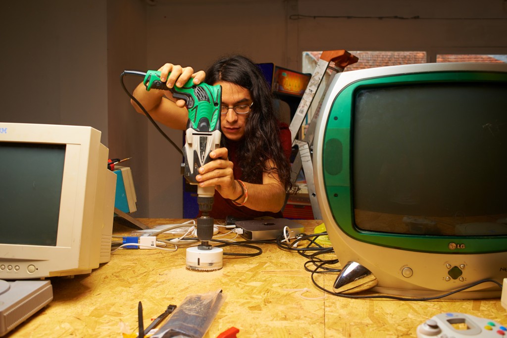
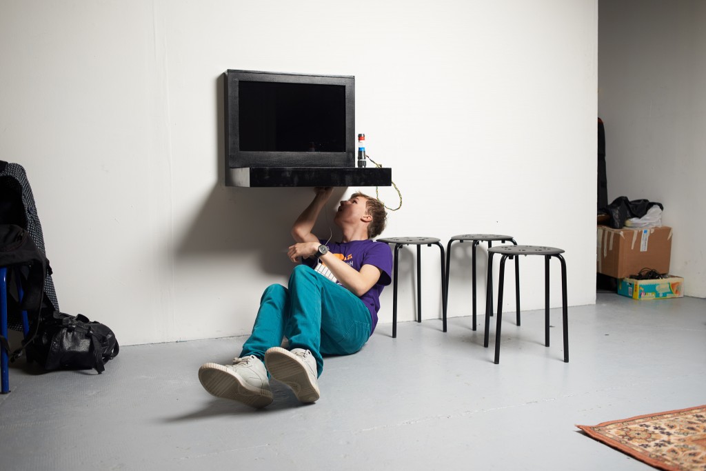
In collaboration with Archeoptérix, a unique Marseille archivist and restoration specialist of obscure and not-so-obscure video game consoles and cabinets, we curated an approximately linear progression of the history of video games, beginning with a reconstruction of Higinbotham’s 1958 Tennis for Two by Grégoire Lauvin. Slipped in, amongst the more well-known Pacman, Vectrexes and a (slyly hacked) Super Mario Bros., were the designs of an entirely unknown parallel history of video game consoles and controllers, the designs of which were to be reconstructed out of the history and æsthetics of video game history. With a nod and a wink to our colleagues in the field, we started describing this method as « Retrospeculative Design ».

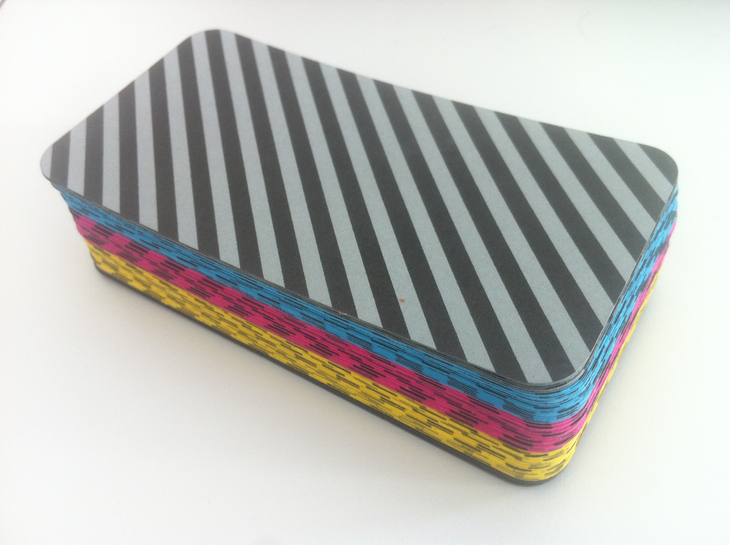
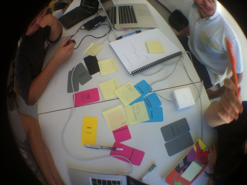
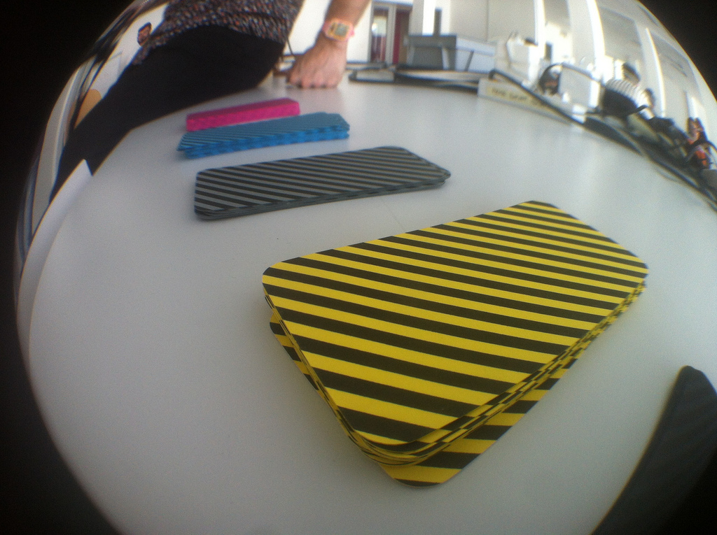
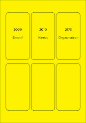
To aid us in our reconstructive efforts, Antonin Fourneau and I designed a series of playing cards to be drawn randomly by each collective group which was made up of at least 1 game designer, 1 human interface designer, and 2 managers. Before each group we placed a deck of cards which were broken down into five different categories : Epoch (yellow), Æsthetics (fuchsia), Technology (cyan), Management (grey), and Black (black). With some slight variance depending on the number of game designers, human interface designers, and managers in each group, the following distribution of cards was selected: 1 Epoch card, 3 Æsthetics cards, 3 Technology cards, 4 Management cards (2x2).

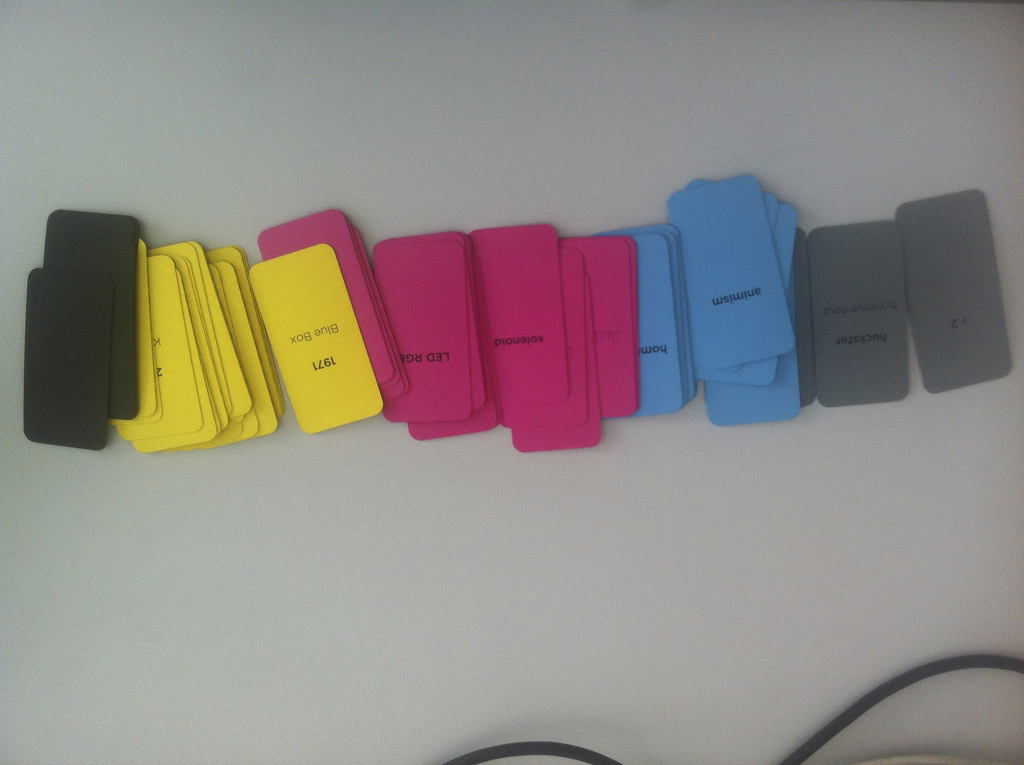
The most important card in the group was the Epoch card. These epochs were organised into what we considered both the significant and the singular dates of the history of video games and video game interfaces. For example, most of the significant players were there: Spacewar (1962), Brown Box (1968), Pong (1972), Simon (1978), Game & Watch (1980), Gameboy (1989), Playstation (1994), Eyetoy (2003), Wiimote (2006), iPhone (2007), Kinect (2010), et cætera. But we also included some important obscure players (and which should probably have been significantly expanded), such as Atari’s Mindlink (1984!), Nintendo’s never-released Vitality Sensor (2009), Woz/Jobs’ Blue Box (1971), and Woody Allen’s ultimate speculative technology device, The Orgasmatron (2173). This last reference of course couldn’t really be considered a game but remains an entertainment interface nevertheless, designed for humanity’s noblest and basest aesthetic desires; given all the cheesy rhetoric coming out of major console press conferences about « emotion engines » and more polygons leading us inevitably to more powerful emotions, one wonders if the final cure we’re all apparently longing for isn’t simply just an Orgasmatron.
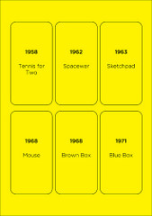
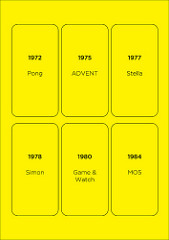
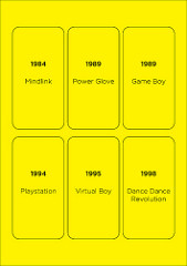
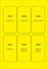
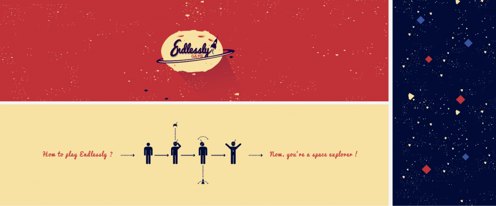
Importantly, the consoles/interfaces associated with each date were not a required aesthetic or even technical reference; they merely gave a quick shorthand as to what was design-able within the epoch of the card. For example, with the project Endlessly, a game/simulator designed for 1968, Felipe Delgado and Marion Tamé (with additional help from Vincent Dubois) had to imagine a game that not only preceded pixels (~1972) and digital integrated circuits (~1970), but even the concept itself of a “video game”. Hence their idea of a “space simulator” that could have been designed for a public open-house of some space center, for example; much in the same way that the original Tennis for Two was simply a sexed-up simulator transformed into a public demonstration of the instrumentation used inside of an atomic research laboratory.
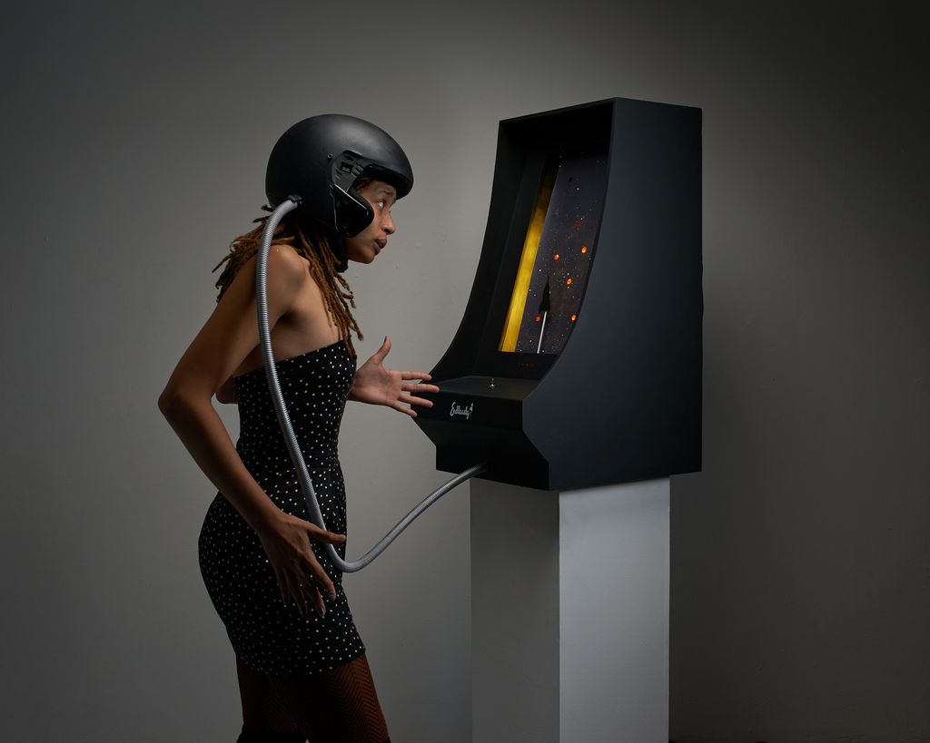
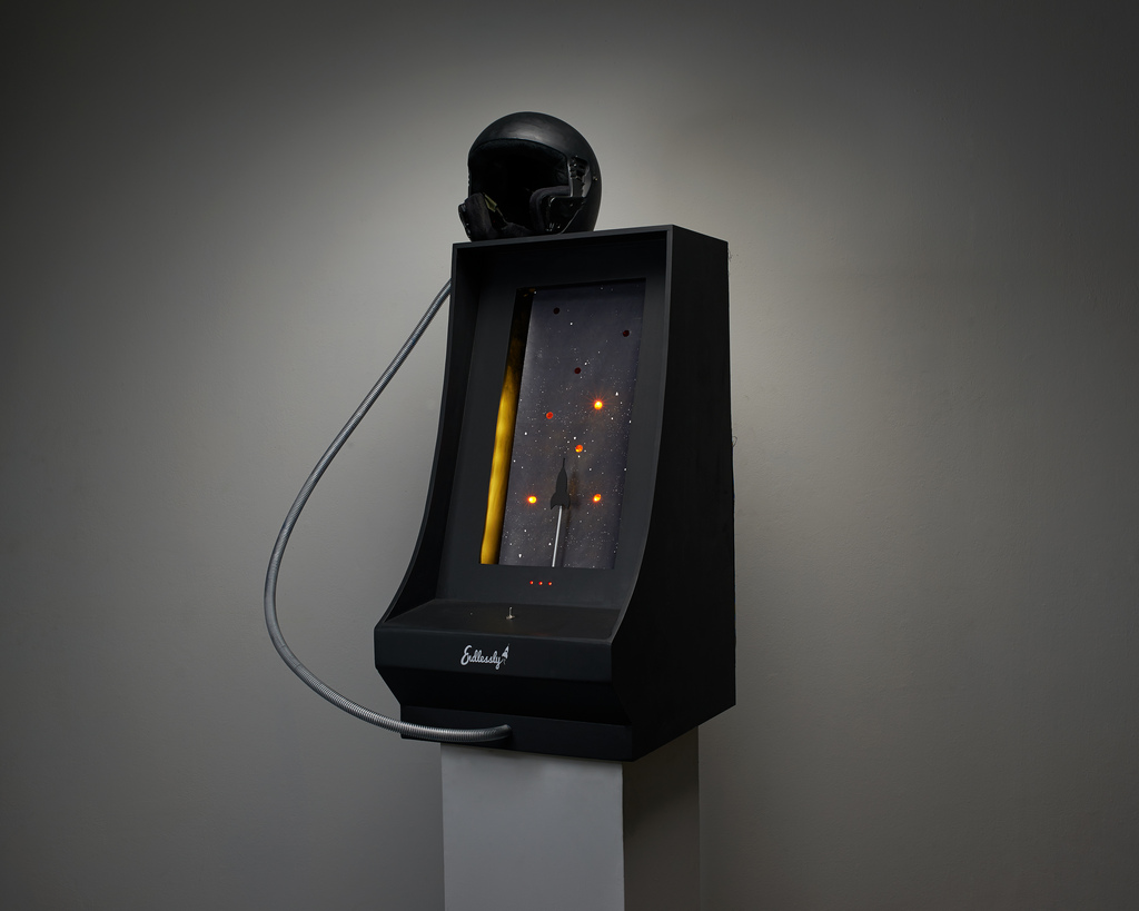
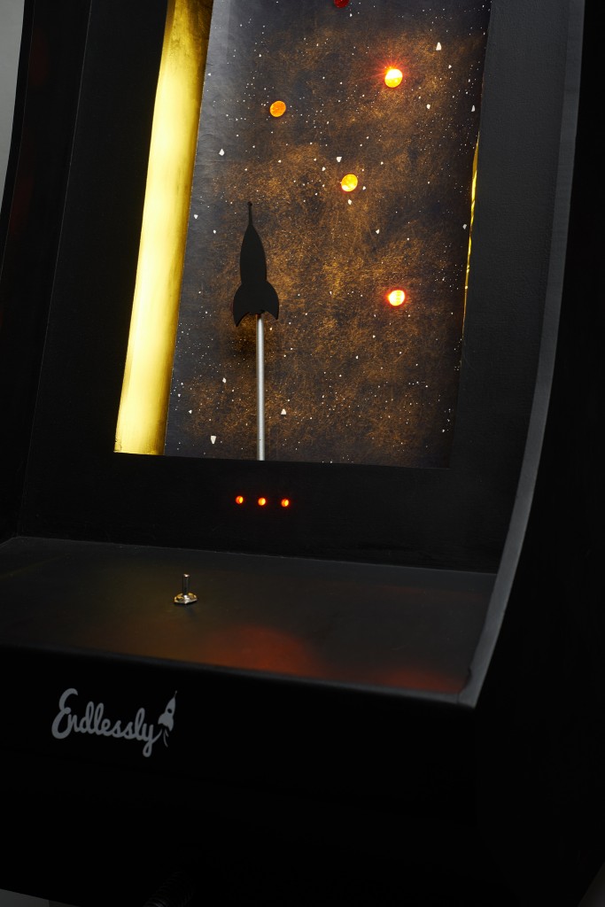
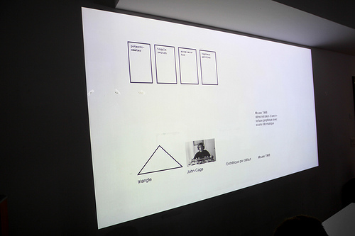
To this 1968 retrocompatible design, the Endlessly designers added the following cards, randomly chosen from the deck: Potentiometer (Technology), Toggle Switch (Technology), Accelerometer (Technology), Ésthetique par défaut (Æsthetics), Animism (Æsthetics), and John Cage (Æsthetics). Using their Management cards, they replaced two technology and Æsthetics cards, and using their Industrial Sabotage card stole the Peltier module from one of the neighbouring groups, and also replaced “Animism” with “Triangle”. Peltier modules are interesting objects for interaction designers as they can alternately heat or cool a surface attached to it, and can do so programmatically. Eventually, through a License Sharing Agreement and some Huckstering, the initial technology holders were able to use regain use of the coveted Peltier module. It should be noted that all of this selection, debating, accelerated prototyping, negotiating, re-negotiating and decision-making took place very quickly: essentially within a very stressful but exciting period of about two hours.
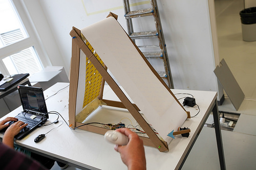
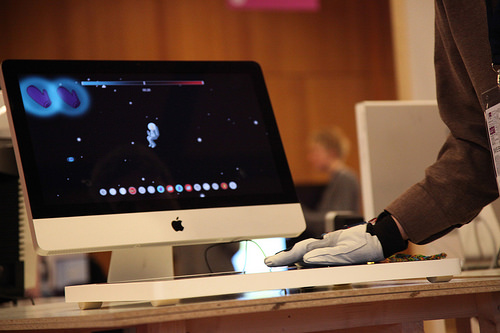
Mixing all these ingredients together, with only one day of training for basic electronics (Arduino) or game programming (Unity), followed by two days of sketching and prototyping with wires, cardboard, and code, the concept of Endlessly was born: a space simulator built out of an infinitely scrolling sheet of paper with cutout holes, backlit to allow light to shine through and create a constantly moving starfield obstacle course. Players wore the attached helmet containing the accelerometers and the peltier modules and used it to control a tiny starship that had to negotiate this starfield without touching any of the holes of light; with each light detection, the helmet would heat up and light an LED of the “overheating” meter; too much overheating and the motor stopped. To play a round of this space simulation game, players would simply toggle the toggle switch.
While we certainly broke quite a few of our self-inflicted rules along the way, the main design challenge of creating a retrospeculative design for a 1968 game allowed us to explore some of the basic tenants of interaction design, and to understand quite concretely many of the historical logics of the epoch. These constraints were not, of course, the actual goal of the exercise, they were merely a means for exploring game design. For the young interaction designer, game designer, or new media artist, this apparently arbitrary exercise ironically ends up freeing the creator from many constraints, most notably the epistemological and æsthetic influences of the present day. My colleague Daniel Pinkas recently reminded me of an apt passage on this subject, taken from Friedrich Nietzsche’s Human, All Too Human wherein he explores the importance of constraints in opening up the possibilities of artistic creation:
The revolution in poetry. The severe constraint which the French dramatists imposed upon themselves with respect to unity of action, place, and time, to style, versification and sentence structure, selection of words and of themes, was as important a training as counterpoint and the fugue in the development of modern music, or the Gorgian figures in Greek rhetoric. To restrict oneself so may appear absurd; nevertheless there is no way to get beyond realism other than to limit oneself at first most severely (perhaps most arbitrarily). - Friedrich Nietzsche, Human, All Too Human, §221. Added to this game of æsthetic constraints, we also added the game of technical or material constraints, which throughout design history has been just as important, if not more important, to the overall process of game design. As detailed in Pix’n Love’s excellent series on Gunpei Yokoi and early Nintendo electronics, the Game & Watch was as much about the next best thing in play, as finding new and unusual uses for what was quickly becoming a glut of overproduced LCD screens for the Calculator Wars. Importantly, design has never taken place inside of a vacuum; neither ideologically, materially, or æsthetically. So it is far more interesting and instructive to follow the intersection of these various constraints, at least from a pedagogical perspective. Instead of teaching young artists and designers how to build pretty Photoshop layers for technology’s latest fad, it would probably be more instructive for their future to confront them with the various ingredients that got us here in the first place.
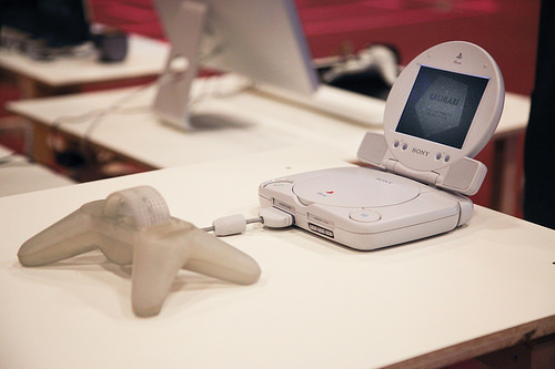
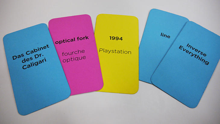
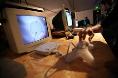
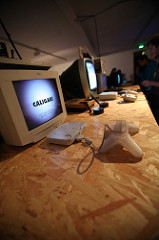
One of the more humorous results along these lines was Catherine Brand and Michael Martin’s Caligari, retroactively designed for Sony’s 1994 PS One, with a retrofuture port for Sony's 2002 LCD Screen for PS One. At the surface level, their proposal might seem perfectly obvious. Having ended up with "line", "Inverse Everything" and Das Cabinet des Dr. Caligari for their Æsthetics cards, it would seem almost natural that they would end up with a video game mashup of the 1920 German expressionist classic and Masaya Masuura's 1999 cult music toy Vib Ribbon. But what to do for a game controller when you've ended up with only two Optical Fork cards as a technical constraint? Imagine you are a lowly Sony engineer in 1994, someone has accidentally purchased 100,000 optical forks, and now you need to design some sort of controller to make use of them. This is the result:
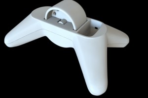
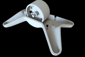
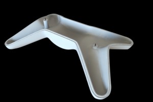
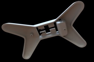
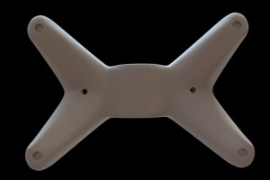
Optical forks are often used inside of mechanical mouse controllers, where an optical encoder breaks the light beam and activates (or deactivates) the circuit; this indeed was the design for the Caligari controller which was 3D printed with holes in the central wheel, which were used to break the infrared beam of the optical fork installed in the base. But if you're that Playstation engineer and you still have 50,000 optical forks to burn, why not go all out and use an optical fork as well for the button? And thus was born the inverted button, activated by inserting your finger into the device. Hence the delicious tag line on the game's home screen, "Stick your fingers in the hole to start".
Caligari from Catherine Brand on Vimeo.
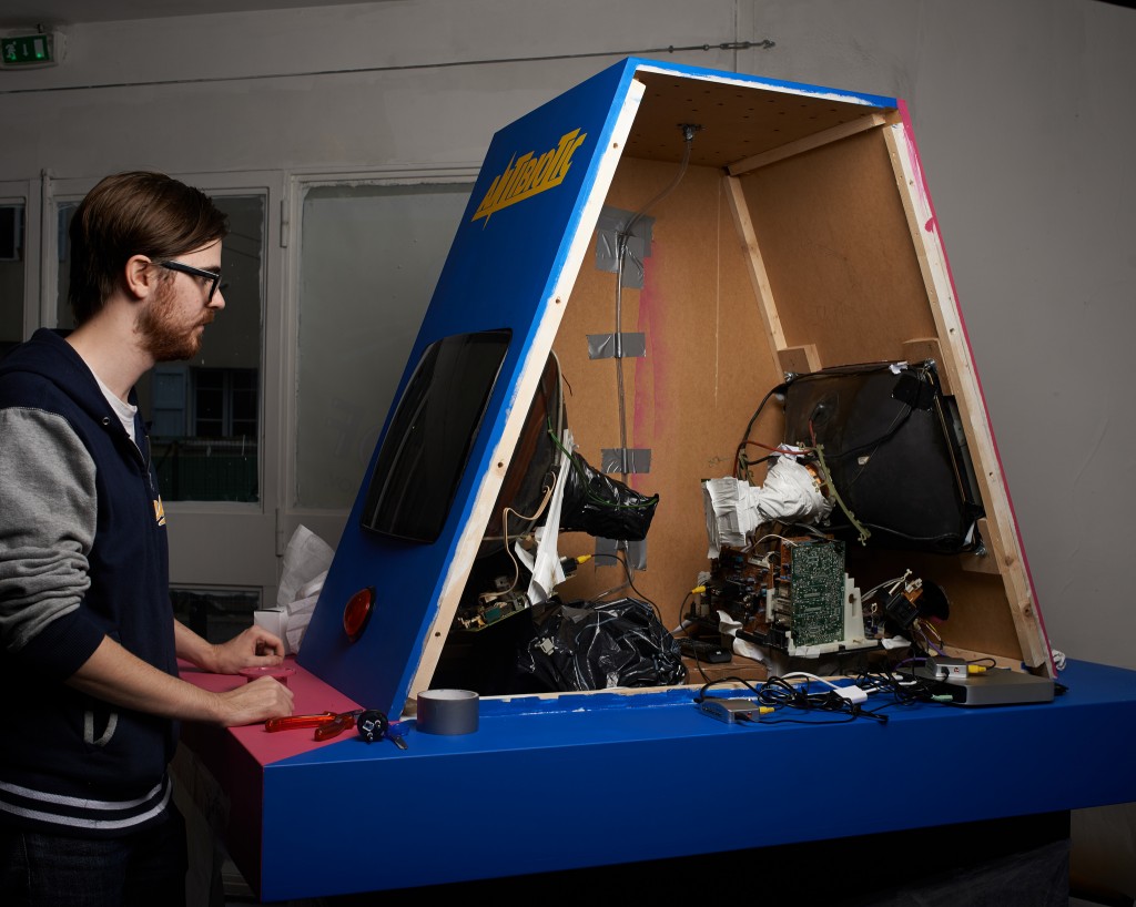
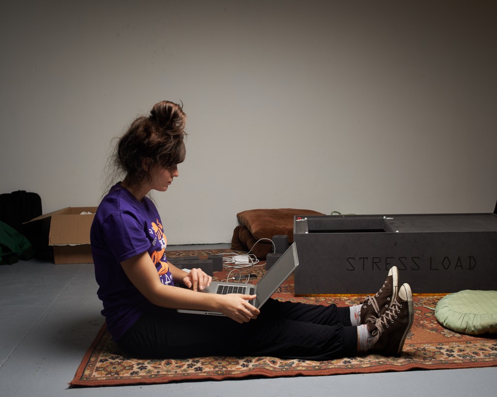
The remaining projects were Stress Load, 1995 by Clément Coubès, Sophie Ros with Camille Morizot; Radioactive Rail, designed for 1989 by Félicien Goguey, Sylvain Joly, Gaëtan Stierlin with Charles Chalas; Antibiotic, 1984 by Kumiko Kuwabara with Matthieu Cherubini, Benjamin Gattet, Nanaoui Amoroso Silva and Fabien Duperrex; Cool Sweat, 2006 by Vytautas Jankauskas, Marika Magnuszewska and Manja Ciric with Benjamin Ben Kemoun.
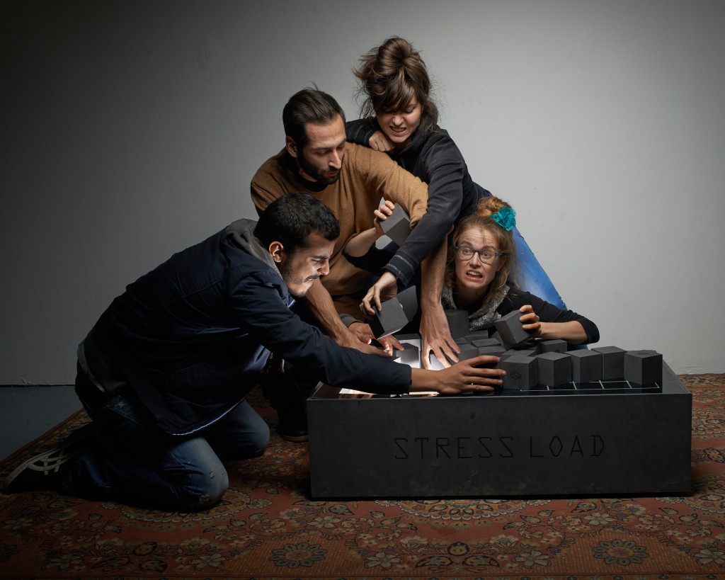
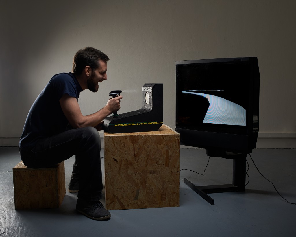
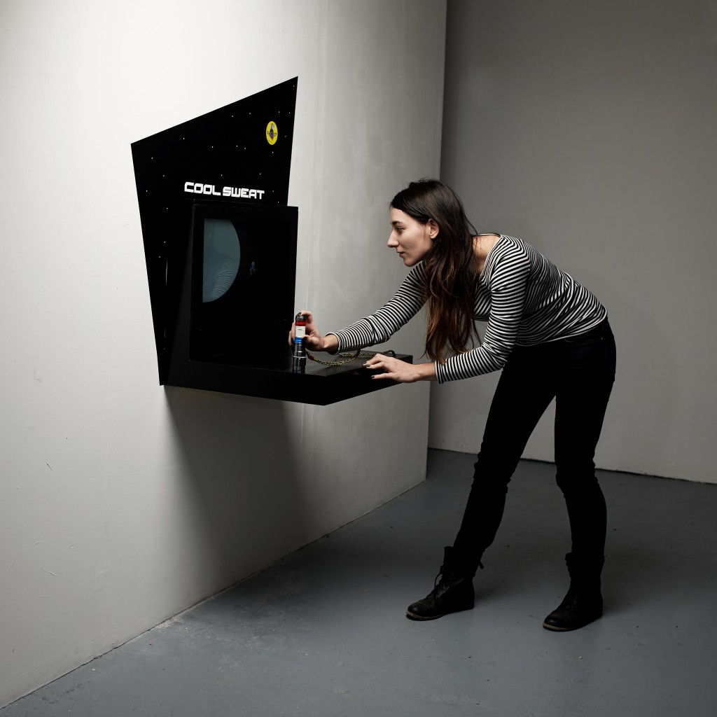
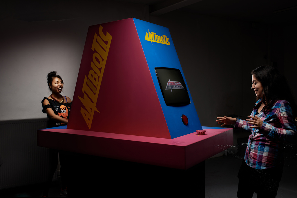
Each one of these projects could be broken down into its various components, influences and constraints that led to its final form. Antibiotic, for example, was designed around æsthetic influences as diverse as "Leandro Erlich", "Chris Burden" and "Freaks", with technical constraints such as stepper motor and clay. Radioactive Rail, for its part mashed a spray bottle onto a joystick in response to a plethora of cards, including "DIY", "black", "humidity sensor", "joystick", and "metal"; and given that Antonin Fourneau is also the author of the brilliant Water Light Graffiti, they also used his water+electricity design as a starting point for their sprayable target. For more photos on the cards and slideshows, head over to Antonin's Workshop HEAD Eniarof Flickr stream, and to my Quality Cardboard Prototype Flickr stream for images of some of the rapid prototypes.
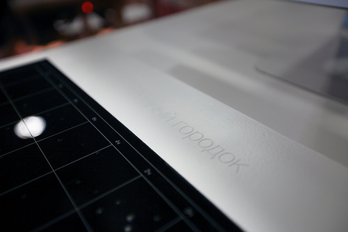
Interestingly, while preparing for an exhibition of the Retrocompatible Museum at Lift14, Vytautas Jankauskas and Marika Magnuszewska decided to redesign Cool Sweat as Star City, remaining faithful to the original constraints all the while transforming it into a soviet-style space simulator. Inspired by the amazing Russian Game & Watch knock-offs, Vytautas and Marika re-imagined звездочный городской as if Russians has designed a haptic space-glove for the Wii era æsthetic. While the cards contained a certain number of very specific references, none of them indicated what country, or even what planet for that matter, these games were to be designed for.
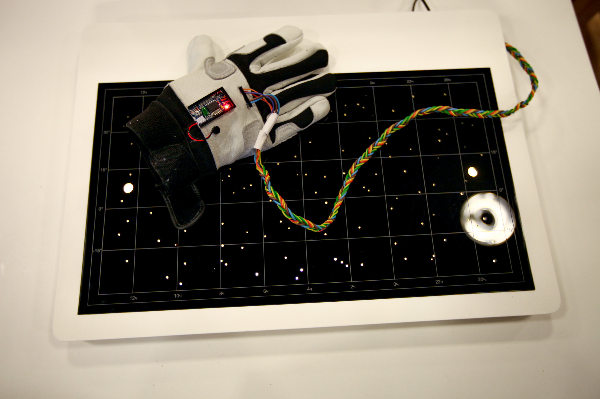
One can always dream, but it really would have been awesome if cold-war era Russian engineers had redesigned a Russian version of the Wiimote; alas, we can only console ourselves with Chinese Wii knockoffs.
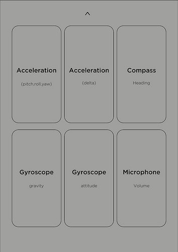
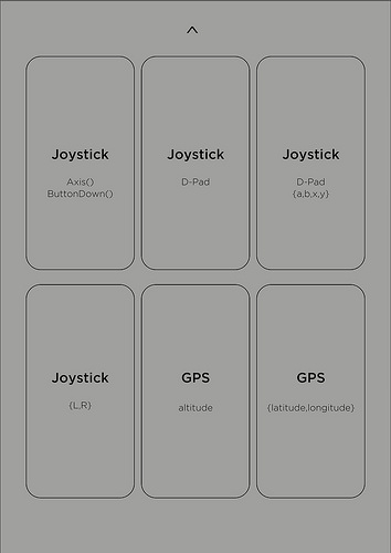
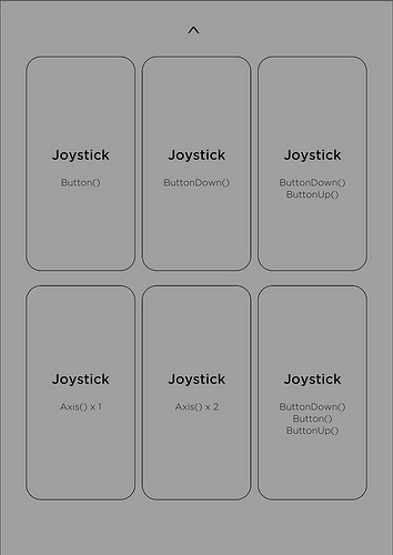
Back over at the Atelier Hypermédia, where we have been exploring game design over the past year within the walls of a Beaux Arts, we have also been exploring these playing cards as a game design prototyping methodology. Some of these mini-workshops have revolved around super-simple card collections such as Input cards, in which participants had to choose one and only one card describing an extremely precise Input method such as TouchPressed(id); meaning the game would have to be entirely designed around the identifier of the finger (#0, #1, #2, #3, ...) and nothing else: no positioning, no movement, no gestures, etc.
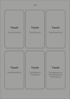
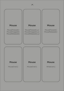
Then, with the game artist Florent Deloison we designed a series of playing cards for a 1-hour "Paper Prototype" workshop that used political, thematic and cultural references to Florent's work: design a game for an epoch in which the Pompidou Center is a tomb glorifying the dead President Pompidou; design a game that can interact with the cerebral remains of John F. Kennedy; design a game for a world in which E.T. is a wilderness documentary; and so on. To this list of "world views", he added cultural references such as "80's D.C. Punk Rock", "Guy Debord", "The Lost Cosmonauts", "I.D. Software", or "Charles Manson". Finally, games were to be designed around one specific technical mode, technique or platform: "abstract", "teletext", "parallax scrolling", "daltonism", "split screen", " ", "low poly", "no pixel", "terminal", “mode 7”.
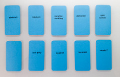
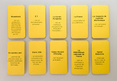
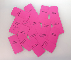
Using a series of "Pairing" cards, designed to take all the stress out of choosing a workshop partner, we broke the students into groups of two, distributed the cards, and instructed them to build us paper prototypes.
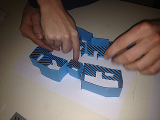
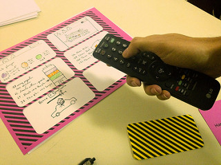
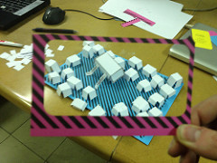
All of the games were "run" by hand, in demo mode, using whatever performance means their bodies would allow (words, gestures, sound effects, etc).
