In 1958, the American physicist created what is one of the first instances of what we would today call a modern “video game”. The game, named Tennis For Two, was built at the Brookhaven National Laboratory for their yearly open-house presentations of the lab’s activities. The game was built using an oscilloscope and a programmable analog computer, the Donner Model 30. It simulated a simple tennis match between two players, with a sideways perspective of the net and a ball bouncing back and forth, controlled by two player-manipulated inputs.
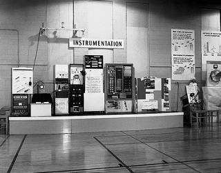
William Higinbotham, Tennis For Two, Brookhaven National Laboratory, 1958
Although it would take a few more years, namely 1962 and the game “Spacewar”, before we could see the emergence of a true modern form of “gameplay”, “Tennis for Two” nevertheless contains enough basic elements of interactive play to connect it to more contemporary descendants, for example the iconic Nintendo hit, “Wii Tennis”. While there are a few missing details here and there, such as avatars, scoring and the various forms invented to interact with the machine, fundamentally there is very little that has changed since “Tennis for Two”. It contains all the modern tropes of animated algorithmic representation, namely a highly kinetic visual form that emerges in real-time from within the game via its gameplay. From this perspective, it is one of the forebears for “arcade” style games. The game is fast and dynamic, and only by interacting with the system does the image emerge.
But perhaps most importantly, “Tennis for Two” is significant in that it is not only a representation of playable interactive visual forms, but that these forms represent something greater than their graphical output: the game is in fact a physics simulator of a ball moving through space and interacting with objects in its path. Watch how the ball bounces against the net and then try to imagine what it would take to program such a movement, even today; then remember that Higinbotham was working back in 1958. For its time, this is a sophisticated simulator of physical interactions:
“The ‘brain’ of Tennis for Two was a small analog computer. The computer’s instruction book described how to generate various curves on the cathode-ray tube of an oscilloscope, using resistors, capacitors and relays. Among the examples given in the book were the trajectories of a bullet, missile, and bouncing ball, all of which were subject to gravity and wind resistance. While reading the instruction book, the bouncing ball reminded Higinbotham of a tennis game and the idea of Tennis for Two was born.” — Brookhaven National Laboratory, The First Video Game?, p.2. In other words, Tennis for Two was not only the first “Pong” game, but also the first physics game, à la Box2D and its shameless re-branding in the infinitely more popular form, Angry Birds. And like Angry Birds’ relation to Box2d, the underpinnings for the game “Tennis for Two” were already inscribed in the routines of the machine itself, the Donner Model 30. These routines were then re-contextualized using what we would today call “joysticks” and voilà: a modern arcade game.
Wii Dog vs Wii Cat & Angry Birds Live, T-Mobile
Given the historical context, there is nothing surprising in this idea of a computer simulating a physical phenomenon such as a bullet or a missile. In the 1950’s, computers were still emerging from World War II era cybernetic formulations of “telelogical” or “self-regulating” machines, precipitated in large part by the acceleration of faster and faster flying weapons that required new techniques for shooting them out of the sky (cf. V-2 Countermeasures). The history of interactivity is traversed by this question of simulation, i.e. by the idea of adaptive mathematical and physical models that could allow machines to regulate themselves in real-time, based on constantly evolving conditions. So while it might be considered a historical curiosity that post-war cybernetic machines would produce the modern video game, it is unsurprising that such a game would be constructed out of a physical simulator of bouncing balls or flying bullets and missiles.
Aesthetics, Simulation, Play
The historical relationship between aesthetics and play has always been a complex one. There is much overlap and interpenetration, but they are in no way interchangeable terms. Most performative art forms, such as theatre or music, oscillate constantly between the ludic and aesthetic realms. In the work of art-game pioneer Eddo Stern — for example his work with C-Level, or his newer Wizard Takes All — we can see these two domains interact with one another in a contstant back-and-forth that suggests perhaps a more fundamental genealogy connecting the two. But despite the deeply connected roots, they are nevertheless two expressive forms that cannot be conflated, all the calls for games-as-art be damned.
But whatever the relationship between aesthetics and play, it is further complicated by this introduction of the principle of simulation in play, made all the more acute in the context of video games. Simulation questions the mimetic tendencies of representation, which might explain in part the constantly recurring uproar over violence in video games (and all the ire over provocative gamer-artists that apparently “hate freedom” ;-). But no matter how small-minded the complaints, people nevertheless understand that these games are not merely mimetically presenting us with representations of violence; instead, they are directly modeling the violence itself of the scene. The resulting image flows from the model; it is a “rendering” of the underlying scene. This is the specificity of simulation: the ability to represent the dynamics of a situation as itself a form of representation. The representation needs to be played in order to take form. This is the historical twist of simulation: the image has shifted from a predominantly mimetic function of re-presentation to that of rendering complex interactions visible through playability. In fact, simulations can take place through other mediums and channels of perception. The American far-west simulator, The Oregon Trail (1971), for example, was a simulator that originally used only textual communication to represent the state of the game. Although modern variants of The Oregon Trail, such as Red Dead Redemption now use sophisticated graphics to represent the game state, the game is nevertheless animated by a simulation engine that cannot be be reduced merely to the artifacts displayed on-screen.
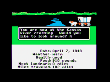

The Oregon Trail (Apple II edition), 1971/1984 & Red Dead Redemption, 2010
A Poor Man’s Simulator
The quality of the simulated movements of the Higinbotham/Model-30 ball and its interactions with the net are impressive, especially when compared to the clunky, almost weightless movements of Pong, designed some fifteen years later. If there were so many games about space in the 70s and 80s, it might be because earthbound physical simulations are hard to design and certainly hard to calculate in real-time, especially when you’ve moved from analog computers to digital ones. Physics are a mostly logarithmic, analog realm, and are hard, or long, to calculate using digital circuitry. Although many games with bouncing balls and gravity would appear throughout the next few decades of digital gaming, it would truly take Erin Catto’s Box2D and accelerometer-based controllers like the Wiimote and the iPhone for the form to emerge as a fundamental gameplay mechanic.
Why so early then our first variant on what would later become Angry Birds? The prophetic nature of Tennis for Two can somewhat be explained by context: Higinbotham was a physicist, whereas Pong’s inventors — Ralph Baer (Magnavox) and Allan Alcorn (Atari) — were engineers. Higinbotham was working with scientific instrumentation that did not adhere to the economic constraints or objectives of Baer who was for his part trying to design mass-producible circuitry that could be plugged into to millions of customers’ televisions.
But it is precisely this poor-man’s quality of video game’s simulators that helped emerge the ludic qualities of gaming. Tennis for Two is frankly a little boring next to Pong, whereas Pong remains one of the best-designed games of all time, giving birth to an infinitely expanding field of variants all the way from Breakout to Bit.Trip Beat.
Ralph Baer and Bill Harrison Play Ping-Pong Video Game, 1969 & Bit.Trip Beat, Gaijin Games, 2009
One of the ironies of video game history relates to this desire to simulate infinitely complex interactions, but with access to only the most mediocre means of calculation. This contradiction has led to what might in some senses be considered an historical anomaly: an in-between period in which computer games’ desire for “realism” would have to wait for the technological means to catch up.
A Poor Man’s Renderer
This anomaly relates not only to the simulation itself, but also to the manner in which it is rendered to the screen. In this in-between period of video game design, situated somewhere between the late 1960s and Box2D (circ. 2006), a cornucopia of visual forms emerged from video games that have given games their distinctive identity as an aesthetic form. We now identify video games as much by their visual artifacts, as by their particular form of gameplay. A truly innovative game will in fact design a specific form of visual artifact, in order to better match the gameplay, outside of any criteria of realism. This approach will often go on to trump the simulation itself and become the central mechanism of gameplay. It is precisely because of the technological limitations of early gaming technology that gaming eventually found its singular language of representation where the graphical artifacts would themselves become the playable form.
Artistic Playgrounds
This playable visual language has even circled back around to influence various forms of visual communication, in order to make them more “playful”. And artists for their part have used this visual language of computer game artifacts to transform less electronic contexts into playable forms. The list could go on almost forever of artists working in this space: Mary Flanagan, Aram Bartholl, Damien Aspe, etc.
In the well-known work of French artist Invader, the city landscape becomes a platformer to be traversed literally, leaving behind physical pixels:


Invader Sneakers + Space Invader in Shoreditch, London
In the aforementioned Eddo Stern’s “portal” sculptures, gaming logics of representation and interaction are re-projected back onto traditional spaces of representation (gallery, public square, etc) in the form of sculpture:
Eddo Stern, Fake Portal, 2012
While neither of these examples are even playable as games, they communicate nevertheless with the video game medium through this imperfect, unrealistic video game form of visual rendering. They look and feel like classical electronic forms of play.
The artifactual visual language of video games is sometimes constructed out of a patchwork of various historical forms that have been redefined through the filter of gaming. Sometimes video games skeuomorphically imitate previous technologies and mediums, for example by flashing television-style signal noise to signify a weak connection, or imitating hand-written messages and drawings strewn about a 3d world (cf. Myst, Resident Evil). But video games have also introduced their own domain of visual logic based on the specific contours of the technological limitations that animate them. Often a closer reading is required in order to reveal the nature of these contours.
Raster-Scan
A strange by-product of the historical anomaly can be seen in the role of the pixel in video games. Originally, as was the case with Tennis For Two, games were built with vectors, as were many related visual technologies such as Ivan Sutherland’s Sketchpad. In fact, Tennis for Two used vectors for both the simulated phenomena (force, velocity, etc), as well as the physical image constructed within the oscilloscope. This is completely logical if you’re looking to construct a physics simulator. This vector-based approach is also the case today, where games are often built out of polygons which — assembled together — construct the playable scene. But somewhere in between Tennis for Two and our modern-day graphics pipeline, came the pixel. And this anomaly, the pixel, continues to this day to influence profoundly the manner in which even vector-based images are rendered to our eyes.
Alan Kay, The Early History of Smalltalk, 1993
Like many of the computing concepts we take for granted today, the pixel concept was perfected in the late 60’s and early 70’s somewhere between Douglas Engelbart’s Stanford Research Institute and the Xerox PARC in neighboring Palo Alto:
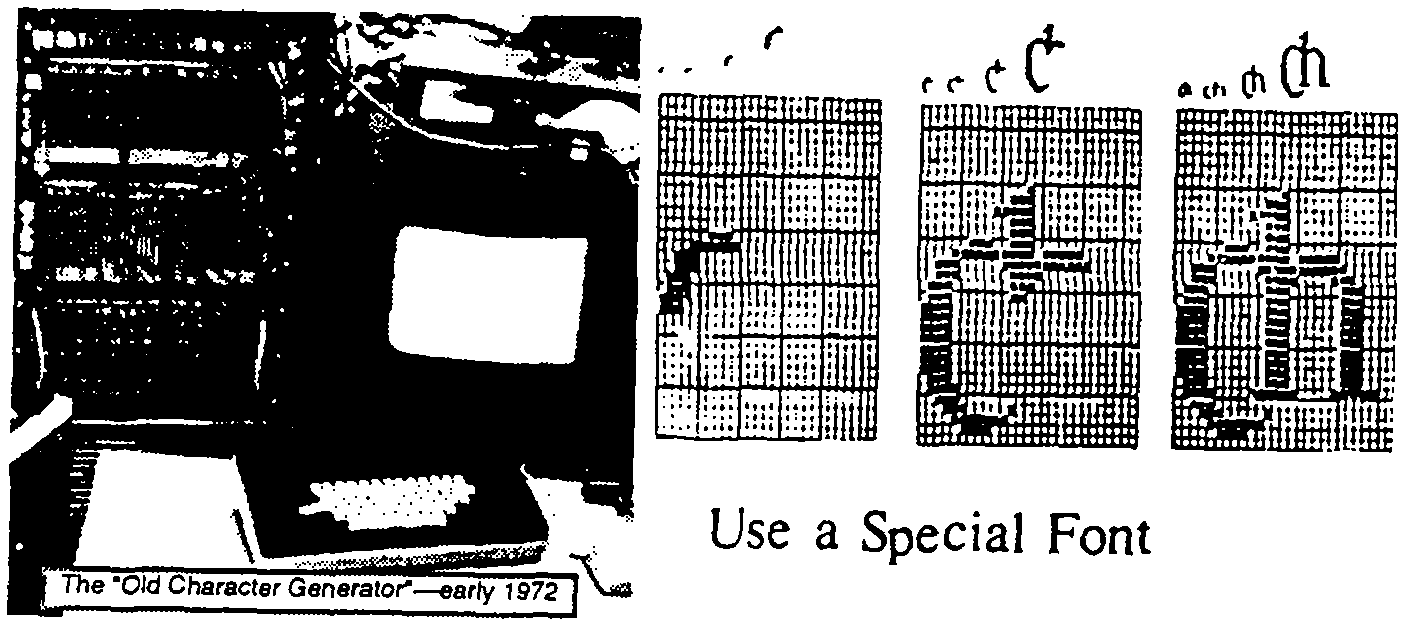
“The TX-2 display that Ivan Sutherland used for Sketchpad […] would project a single bright spot on a dark screen and then electronically move that spot around to trace out a circle, say, or the letter A. By tracing and retracing the pattern very, very fast, [it] could create the illusion of a solid outline. […] The problem was that the more complicated the drawing, the faster you had to wiggle that spot. […] Then there were the “raster-scan” displays that Bill English had developed for the “PARC Online Office System”, POLOS. […] The POLOS displays used digital electronics that were better suited to the binary world of computing: in effect, they would divide their screens into a fine grid of “pixels” and then make a picture by turning each pixel either on or off, as appropriate, with no shades in between. […] The programmers would have a much easier time devising graphics software to generate those images, because all they had to do was define a chunk of computer memory to be a map of the screen, one bit per pixel, and then drop the appropriate bit into each memory location: 1 for white and 0 for black. […] Unfortunately, that use of the computer’s memory was also the major difficulty with bit-mapped graphics: memory was very, very expensive in those days.” — The Dream Machine. J.C.R. Licklider and the Revolution that Made Computing Personal, W. Mitchell Waldrop, Penguin Books, 2001, p.366. In many ways, “bit-map” graphics are simply a historical hack used to generate text and images dynamically on a screen. In the case of the heavily text-centric Xerox PARC machines, one would assume that a more vector-based image generator would make more sense: typography is essentially a history of shapes built out of lines, with a visual language heavily influenced by the traits of handwritten letterforms. In fact, it took some thirty-odd years, led by Apple’s “retina” ultra hi-definition screens, for bitmapped text to match the quality of the printed page. So it could probably be argued that the “bit-mapped” approach was historically the wrong one, even if it is now somewhat catching up.
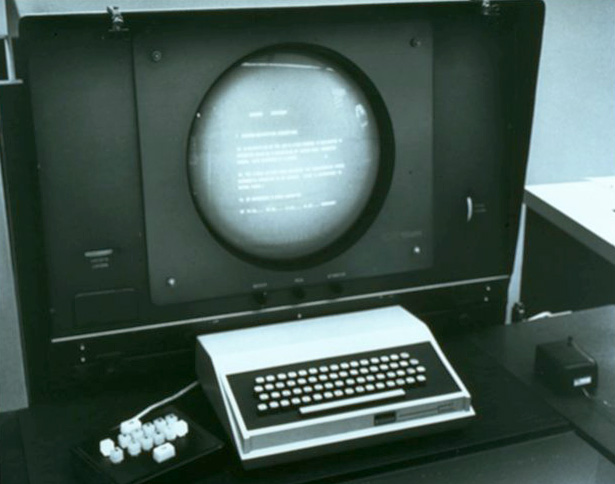
Douglas Engelbart, Workstation With Mouse, Agumentation Research Center, cir. 1964-1966
Maze War, Xerox Alto, 1974
But from a purely technological, engineer’s perspective, bit-map images make all the sense in the world. In the above quote we need only retain that “the programmers would have a much easier time…” in order to understand why the pixel approach won out. Computers are “discrete” machines, capable of switching parts of itself off and on independently. This logic gives us random-access memory which in turn gives us databases, which in turn gives us things such as hyperlinks. Machine architecture influences use and to assume that this would not influence the resulting aesthetics is naïve. The infinitely re-configurable and re-contextualizing nature of the machine is the whole point of why we use these damn things. So an image construction method that would closely match this discrete logic, down to the very 0s and 1s of the machine’s ABCs, was an important step in creating a “plastic” image, capable of reconfiguring itself multiple times per second. It is out of just such a type of image that video games as a medium emerge.
Raster-scan vs. Vector-scan
Let’s compare two images from two iconic video games from 1980, Battlezone and Pacman.
Battlezone is a vector-based game, and originally used a vector-scan method for displaying shapes on-screen. This created razor-sharp images, albeit in black-and-white, or actually black-and-green. The use of vectors also allowed Battlezone to be one of the first mass-market games to effectively represent a three-dimensional scene, using the first-person perspective of a tank commander to navigate the game space. It would be many years before a pixel-based computer system could anywhere approach the visual elegance of early 1980s 3D games such as Battlezone, Star Wars or Tempest. One of the great iconic raster-based 3D games, Castle Wolfenstein, wasn’t even in 3D at its introduction in 1981; and even when it became Castle Wolfenstein 3-D in 1992, that visual representation was made up of large blocky pixel shapes, far inferior to Atari’s 1980’s graphical representations. But Battlezone’s vector-scan technique also created some curious visual anomalies: for example objects on screen were fully transparent, defined solely by their outlines without any possibility for image “textures” to fill in the gaps. This created the odd situation where an enemy tank could be seen transparently on the other side of an obstacle, but could not be shot at. In a sense, this improved the gameplay and created part of the strategy of playing Battlezone — no matter what level of realism it achieved as a simulation. Ultimately, it was a game made for fun, for play, but even so it would eventually be used by real tank commanders as a training simulator for their soldiers. The simulation was good enough so as to be a functional form of training in the real world manipulation of tanks.
Visually, Pacman (a.k.a. Puckman) is a very different animal. Contrary to Battlezone, or even the more-colorful Tempest, Pacman is practically drenched in color. Ghosts are brightly-colored with different hues based on character traits, allowing players to read their individual algorithmic behavior within the game. The player’s character, Pacman, is a completely opaque bright yellow animated blob, full of visual charm. Like the ghosts, he is full of personality. Color is even used as a gameplay element, allowing players to distinguish between dangerous ghosts (multi-colored) and edible ones (blue). Everything about Pacman screams “bit-map” techniques: the maze is a series of bit-mapped 0s and 1s, turned on or off to represent a wall or a navigable open space. And the dots or crumbs that we eat are also represented as a bit-map, i.e. a scattering of pixels that we have to turn off by running our character over them. In Pacman, the gameplay, in fact the whole game algorithm, is directly controlled by the graphical representation, as opposed to Battlezone where the graphical representation is often in contradiction with the physical simulation of interaction with physical objects. Pacman is a collection of pixels, he lives to eat other pixels, and the level is over when there are no more pixels to be eaten. Pacman essentially spends his time running around a memory map until he has effectively manipulated all the memory registers by setting them all to 0. The internal circuitry of the machine is visually exposed to the player who is then asked to navigate into this memory register map and manipulate the digital switches via an on-screen representation.
Cellular Automata
While it is not technically a video game, and was in fact designed as a scientific simulation experiment, John Conway’s Game of Life is nevertheless one of the best examples of one of these immanent pixel-plane spaces from which a “playable” image emerges. The “game” is played entirely by comparing one pixel to the pixels that surround it: too many surrounding pixels, the pixel dies from overcrowding; too few, it dies from lack of resources; and from just the right number of pixels, a new pixel is born (if none) or survives (if already alive). The visual representation of the life “game” is exactly the same map of values as the memory registers that control it. There is no representation of the simulation outside of the frame of the grid. Based on this immanent principle, a complex interaction of forms emerges, hence the term “game of life”.

Conway’s Game of Life, 1970
One of the best known games of all time, Sim City, was directly inspired by this Conway thought-experiment:
“[John Conway’s work] is so extraordinary, because the rules behind it are so simple. It’s like the game Go. […] They can arise from fairly simple rules and interactions, and that became a major design approach for all the games: “How can I put together a simple little thing that’s going to interact and give rise to this great and unexpected complex behavior?” So that was a huge inspiration for me.” — The Replay Interviews: Will Wright, Gammasutra, 23 May 2011.
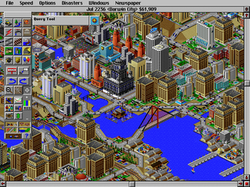
In Conway’s Game of Life as well as Wright’s Sim City, the immanent pixel grid is the space itself of the “game”, conflating both the pictorial representation and the simulated one. It is the “map” upon which the simulation of SimCity, an architectural construction if there ever was one, would be built.
Animation
Another significant trait found in pixel-based games such as Pacman, far more absent in vector-based games, is the narrative dimension. Pacman tells a story, and even introduced comedic interludes every few levels, telling little Keaton-esque sketches of Pacman being chased by ghosts and then turning the tables to chase the ghosts in turn.
Pacman cutscenes, arcade edition 1980 & Atari 800 edition, 1983
Many interactive characters were built out of these basic, often extremely limited, collection of “bit-map” pixels: the whole Pacman family (Pacman, Ms. Pacman, Pacman Jr., etc), Mappy, Dig Dug, Mr. Do, Mario, et cætera. Even known animated characters — such as Popeye —, found their way into the heavily pixellated game screens of the 1980s.
There is nothing arbitrary about this use of cinema-animation logic aesthetics to animate the characters of early video games. For animation had already solved this problem of opening up cinematic figuration by eschewing realism and embracing the artificial nature of the image. Gerty the Dinosaur, Betty Boop and Felix the Cat, all the way up to La Linea and Don Hertzfeldt’s pencil-drawn absurdities: these are all forms of reduction down to the visual interaction of a few basic visual forms. So too in video games: the key to their success in adding expressive characteristics came not from the militaristic, cybernetic-inspired scientific simulation instrumentation. Instead, it came precisely from embracing the abstract, graphical, nature of their primitive cousins and in accepting the artifactual, visually limited detail of the early digital machines. In accepting this fate, video games tapped into a deep tradition of expressive visual tapestries that had been explored throughout the 20th century in cinema through the work of experimental film-makers and animators such as Len Lye or Norman McLaren, using simple abstract shapes such as lines, scratches, and blobs of color to great expressive effect.
Dots, Norman McLaren
Free Radicals, Len Lye, 1958
Vanishing Points
Although the term is a bit dubious, we are exploring here the problem of realism, or perhaps more specifically that of mimesis, i.e. the art of imitation. A significant historical component to this debate on art and realism relates to the introduction of a very specific form of pictorial representation: geometric perspective of the sort demonstrated by Brunelleschi in the early 1400s. In our parallel history of video games — notably as it traverses its naive period of representation —, we as well can see some interesting effects of perspective as it relates to how images are constructed on-screen.
Due to the purely arbitrary nature of the discrete pixel grid where any section can be turned on or off at will, a strange form of mixed perspective becomes possible with multiple forms of perspective not only co-existing on screen but even interacting with one another. Pacman and the ghosts within the maze are completely devoid of principles of foreshortening and vanishing points, and are in fact a mixture of top-down vertical perspective (of the maze), and side-view perspective (of the characters) reminiscent of early forms of perspective emerging in the work of Giotto where, to take an observation from Deleuze & Guattari in Mille Plateaux (p.219), Christ alternates between divine receiver, enduring the stigmata, and kite-machine, commanding the angels and heavens via kite strings.


The emerging nature of the Brunelleschian-style of geometric perspective is not fully developed at the time of Giotto, hence the optical oscillations for a modern eye between flatness and depth, foreground and back, and so on. Jesus is at once commanding Saint Francis, and simultaneously being flown by him like a kite. It is only through narrative cues, understood by semiotically reading the painting, that we are able to reconstruct these spatial relationships between the various figures.
Like many paintings from the middle ages to the early renaissance, perspective in early video games contain multiple points of view and often chooses its perspectival representation based on contextual narrative needs. These are naïve and/or mixed perspectival geometries (cf. Tapper, Zoo Keeper, et al.) that have recently been exploited to brilliant effect in Polytron’s visual delight, Fez.
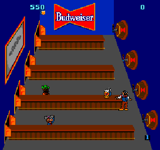
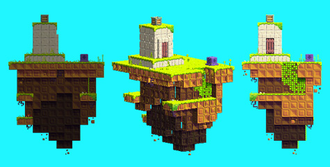
Tapper, Bally Midway, 1983 & Fez, Polytron, 2012
We could also mention Game Yarouza’s Echochrome where the gameplay takes place somewhere in between the OpenGL pipeline where vector data is rasterized into pixel data and itself becomes a gameplay mechanic as players exploit visual absurdities and try to line them up.
Echochrome, Game Yarouze, Japan Studio, 2008
Such hybrid forms of perspective would have been much harder to acheive had gaming stuck with purely vectorial and mathematical forms of representation.
Visual abstractions
It might be temping, based on such an art-historical exposition, to start comparing video games to the history of art and graphical design. For example, it would be fairly easy to visually juxtapose the paintings of Piet Mondrian/De Stijl, with Taito’s 1981 arcade classic, Qix:
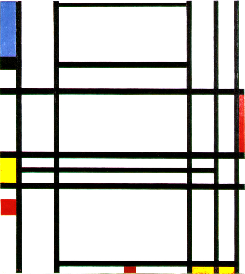
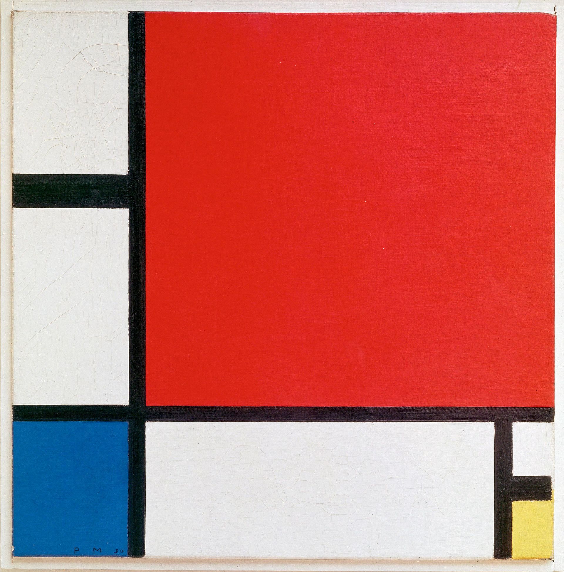
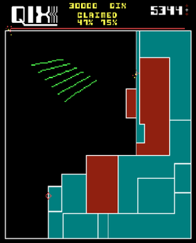
Piet Mondrian, Composition 10, 1939–1942 & Piet Mondrian, Composition II in Red, Blue and Yellow, 1930 & Taito, Qix, 1981
Obviously, on some level there is a visual inheritance taking place, either explicitly, culturally or unconsciously, even though such causalities are either impossible to prove or even, if true, merely anecdotal.
Another juxtaposition might be to look at the Russian avant garde, starting with El_Lissitzky, and compare his visual language with the shapes and forms of more abstract forms of video games, including early 3D games that had not yet perfected their perspectival rendering engines:
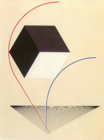

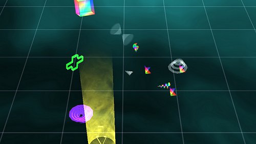
A Prounen, El_Lissitzky, c.1925 (cf. Prouns) & Sixty Second Shooter, Happion Laboratories, 2012
Blaster, Williams 1983 & Ballblazer, Lucas Arts 1984
Rez, Tetsuya Mizuguchi, 2001
The problem, ultimately, with all these approaches is that these are merely visual cues and not aesthetic ones. The problem with just such a visualist reading is that it assumes that both De Stijl and Taito constructed their representations purely as visual tableaux — in other words as just a bunch of pretty pictures —, instead of looking at the material, conceptual and historical visual languages and logics that might have led them there. In the case of Qix, it would probably be far more instructive to compare its geometric abstractions to early MacPaint software, and Bill Atkinson’s visual algorithms that made it possible, especially since these routines would go on to influence gaming history via Bill Budge’s Pinball Construction Set. To begin with, both Qix and MacPaint were built as profoundly raster images, and both use similar algorithms for “painting” in their geometric forms. But more importantly, much of Atkinson’s work, like that of Qix, was not only an attempt to find an algorithmic method for interactively constructing visual output, but to do so within the constraints of a Motorola 68000 microprocessor using 128kb of memory.
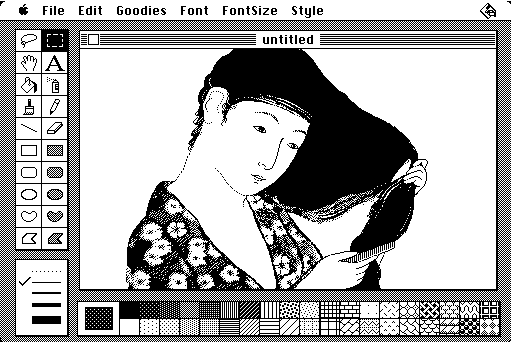
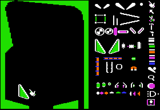
MacPaint, Macintosh, 1984 & Pinball Construction Set, Bill Budge, 1983
And again, we can see even in these early days of MacPaint, that in order to construct the computer image in a visually compelling way, Apple’s marketing machine opted to look back to previous techniques of image construction, here the japanese wood cut, and not to that of the photograph.
Pixel Clouds
One of the most beautiful games to emerge in the last few years is Proteus, a love-letter to this naive period of highly pixellated gaming. Only here, the game is rendered with a modern vector-based graphics pipeline. This creates a strange oscillation between the utterly fluid 3D navigation, and the giant blocky pixellated landscape. Trees, shrubbery, waves, raindrops, animals: everything has been reduced down to a limited grouping of pixel blocks.
In Proteus, we walk around the simulation of an island world and explore its aesthetic qualities: sound, color and shape all interact in an elegant generative landscape. There is no real “goal” to the game, although season-shifts can be provoked in a pleasant transition that eventually leads the player to new forms of gaming experience. The whole experience suggests that perhaps some new media form — of an entirely new quality — could be afoot in what we call gaming, although I cringe to qualify such a future as “just over the horizon” because gaming has been promising such an unattainable land for the past several decades. Still, the hope here is that this emerging form is less about Holodecks and more about the raw interactive audiovisual experience of this new media form.
The ultimate goal of Proteus, I suppose, is that of aesthetikos, i.e. sensation, or perhaps more accurately the experience itself of human sensing. In other words, we are talking about aesthetics in the Kantian sense of a search for beauty — via the senses — that eventually discovers itself in the limits of its search (cf. Sublime). For, the overall effects turns out to be indeed highly romantic, something akin to a multidimensional interactive 8-bit rendition of a Turner-esque tone poem.
While playing Proteus recently, I found myself in a curious situation. I was high up atop one of the hilly peaks of the island, watching as night began to fall and rainclouds emerged below. As I descended down from the hill and onto the rain-soaked plains, I suddenly found myself awash in a pure sea of color that originally felt like a visual glitch: while I could still move somewhat, it seemed that any direction just led me to more colored polygons rendered as flat shapes. For a few moments, I even imagined that the game engine had crashed and I started to reach for the ESC button to get myself back in control of the machine. But then, slowly, I began to realize that I had merely descended down into the level of the clouds themselves and was swimming in the middle of their visually depth-less space. Anyone who has flown in a plane knows this de-spatialized zone while traversing the clouds: there is no focal point or point of reference and everything feels atemporal and ethereal. Essentially this is what happened to me looking through the little portal of my computer screen, the same logic taking place on a purely representational level of pixels that refused to figure the depth contours of the objects in space. Finally, I just leaned back and watched as abstract geometric shapes of treetops re-emerged only to be submerged again in swaths of color as waves of clouds chased ever more waves of clouds. It was a profoundly pleasureful oscillation between recognition and disorientation, one of the key ingredients to many successful works of at. Eventually the cloud formation began to recede from my point of view, and the three dimensional perspective of the landscape re-emerged, re-aligning the simulated first-person perspective of my view portal onto a three-dimensional landscape.
The beauty of the moment had something to do with what the art-historian Hubert Damisch calls the théorie du /nuage/ or theory of /cloud/. The term /cloud/ is written with two slashes in order to reconstruct in text the odd, receding nature of clouds from realism and perspective and their re-apparition within the tableau in the form of a semiotic signifier, almost like a placeholder or an asterisk. Clouds in classical painting are the limit of perspectival representation, the resistance of aesthetics to the mere logics of mimesis and perhaps even of representation. Whatever the case, it is the limit of the realism model of aesthetic forms (cf. Cory Archangel’s Super Mario Clouds).
This limit of perspective within a three-dimensional simulator takes us back to Battlezone and its visual, artifactual, limits. And this limit speaks to one of the fundamental problems confronting video games today, beyond the problem of figuration and by extension the problem of figuring the human face. This representational limit of the /cloud/ in Proteus is what we could call the limit of realism as a model for what simulations, and therein gaming, seek to achieve.
Taken to its limit, these clouds of Proteus have their cousin in a wonderful little game built by two lifetime members of the glory days of the Atelier Hypermedia: Pascal Chirol and Grégoire Lauvin. In their collaborative piece NEVERNEVERLAND Color Suite, a 3D simulator and a joystick open up a landscape of nothing but infinite gradients of color:
Consider it a 3D simulator of navigation within the color selector of your favorite painting software. And it is also probably one of the outer limits only an artist can propose to the world of gaming in its relationship to the aesthetic realm: a landscape of color, a perspective of visual artifacts, as itself the “goal” of the game. Via play, via simulation, we are now beyond play, beyond simulation, and even figuration; the play has moved into the aesthetic realm, the domain of sensation, opening up an entirely different sphere of experience than that of the reconstruction of a physical world. This is a playable aesthetic world, not beyond ours, but instead immanent to a new field of perception within our world: the realm of artifactual play.

