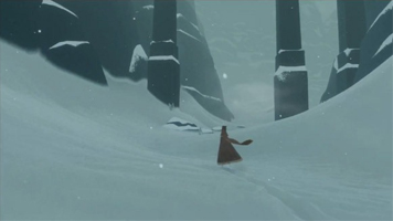
A significant percentage of video games employ in one way or another the figure of death. The thanatological sub-species of video game representations are practically endless: dismemberment, infection, untreatable wounds, explosion, etc. Players can be eaten, crushed, sliced, diced, quartered, electrocuted, impaled, and so on. Many of these representations are more or less approximate: in Doom, for example, a player’s state of “health” is represented by an abstract percentage value where players do not die of any specific organ failure, but instead from some sort of provoked exhaustion. In role playing games, players kill their opponents in a similar manner, i.e. by reducing this all-encompassing numerical value of their enemies to zero. In other games, players simply keel over, or disappear in a puff of smoke when touched, as in Pacman. In Super Mario Bros. players can just run out of time. Death in gaming is more a question of symbol than of substance. While we are still in the realm of simulation, the simulation is so figurative as pull us into an wholly other realm of representation. In his 1972 article on transcendence, gaming and “computer bums”, Stewart Brand used the term “symbolic” to describe the flickering figurations of death slowly taking over university computer science research consoles: Fanatic Life and Symbolic Death Among the Computer Bums.
////
The need for death in gaming is multifaceted. The cynical argument, largely based on the arcade experience, might describe death in gaming as an economical equation: in order to make more money, games needed to provoke death as quickly as possible in order to get to the next “insert coin”. But death in gaming has been with us practically since the beginning, or at least since 1962’s Space War, long before the video game arcade phenomenon became an economic reality.
A less cynical, more narratological reading of eschatology and gaming might look at death as a question of motivation: by introducing death into the game, a certain internal dynamic is created, which in turn heightens the gameplay and structures the temporal form of the game itself. Given that the player will eventually die (from inaction, from inattention, from error, etc), the goal of the game becomes that of survival. The “game over” screen provides some sort of closure to the game and proposes — albeit post facto — a redefinition of the initiating act of the game: “I want to play” has now been translated within the gameworld into “I want to live”.
A third approach would be to look at the material substrate of gaming itself: video games are played on machines and machines, eventually, break down. To quote Felix Guattari: “Machines are instilled with a desire for abolition. The emergence of the machine is accompanied by failures, catastrophes, and death which haunts it. La machine est travaillé par un désir d’abolition. Son émergence est doublée par la panne, la catastrophe, la mort qui la menace.” Chaosmose, Éditions Galilée, 1992, p.58. From this perspective, we could see the figure of death in gaming as an extension of this fatal impulse of the machine. The figure of death would be an attempt at sublimating the machine’s death drive into a poetic form — a form upon which a game world might be built.
////
*Spoiler alert: you probably shouldn’t read any further if you haven’t played the games Passage (Free/Cheap, Mac/PC/Linux/iOS) or Journey (~15€, PS3). Especially Journey. Read at your own risk.
While many video games represent death within their gameworld, or use death as a mechanism for the gameplay, there are three games in particular that employ death as the central raison d’être of the game:
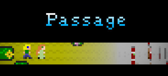
Jason Rohrer’s 2007 conceptual/indie gem Passage
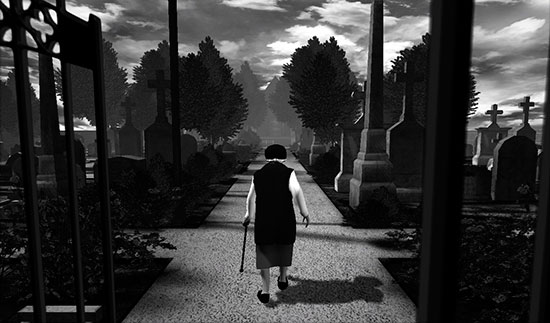
Tale of Tales 2008 art-game meditation The Graveyard
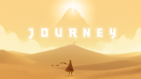
That Game Company’s latest (and greatest) creation Journey (2012).
Long story short, all three of these games represent a character advancing towards his or her death.
In Passage, a young man in a highly pixellated two-dimensional gameworld begins at the left side of an open maze and advances towards old age and death on the right side of the maze. During his passage from left to right the spritely blond-haired man evolves into a balding gray-haired old man who limps his way to his final steps. Early in the game he can choose love (or not) with a young woman who will age with him throughout the rest of the game. Their coupling makes the game more poignant, especially the ending, but renders certain movements more difficult within the various passages of the maze.
In The Graveyard, we embody an old woman visiting a graveyard. The game is played in three-dimensions, using the standard aesthetic of real-time engine based rendering, albeit with the nice touch of a black and white palette. Like Passage, the game is short and spatially limited: the old woman can move forward or backward on a short path leading up to a church and a bench where she can sit down. As she rests, a song about nostalgia takes over the game, and (in the paid version) ends with the death of the woman, slumped over on the bench.
Within the world of “indie gaming”, Journey is a Sony-funded super-production/mega-blockbuster behemoth, especially when compared to the one/two-person auteurs of the two previous games. Even if That Game Company, the creators of Journey, remain a relatively small studio, the production values here are on an entirely different scale. As can be expected, there is more or less a traditional game here, full of beautifully rendered levels to explore and tokens to collect, and even an extremely subtle use of networked multiplayer gaming. But the title is a thinly veiled manifesto — precisely in the vein of The Graveyard and Passage —, on the possibilities of gaming as a medium for sensitive experience (aisthetikos) beyond the goal-oriented mechanics of traditional gameplay. Here too, the player advances on a path leading unambiguously to their death: inevitably, inexorably, and joyously. And once this goal of the game has been more or less removed as a form of strategy, or at least relegated to a mere point of reference, the game switches into a more symbolic realm.
////
There this great moment at the beginning of the filmed dialogue on Arte TV between game designers Chris Crawford and Jason Rohrer, filmed at the Independent Games Festival in 2009. While discussing Passage, Crawford begins by suggesting that the significant bit of the game comes from the introduction of a relationship between spatial navigation and metaphor:
“What is, I think, most important about your approach is that you’re taking the idea of spatial navigation — which has always been done too damn literally —, and suddenly turning it into metaphor. And then exploring, well, what kind of metaphors can be explored with spatial systems?” — Chris Crawford in Au coeur de la nuit : Jason Rohrer et Chris Crawford; Arte TV; Durch die Nacht mit…; episode 61; July 2, 2009; 08:40.
Like the figure of death, the history of spatial design in video games is as long as the history of video games itself. In many ways, the form or shape of a video game world, and the way in which that world is mapped onto its display, is so determinate to the game in all its aspects that it becomes more or less conflated with the game itself.
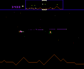
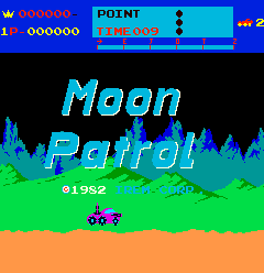
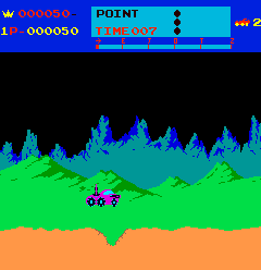
When Super Mario Bros. was released for the NES in 1985, it used a form of spatial representation — sideways scrolling —, which had already been explored extensively by a multitude of games before it (cf. Defender, 1980; Scramble, 1981; Pitfall!, 1982; Moon Patrol, 1982; etc.). So while Super Mario Bros. did not invent sideways scrolling, it nevertheless added a significant novelty by equating this left-to-right movement with not only the advancement of the game strategy (survival), but additionally with the advancement of the game narrative. In Super Mario Bros., this left-to-right movement is not only about advancing the player, it is about advancing the story itself. Taking much of its inspiration from Lewis Carroll’s Alice in Wonderland, Super Mario Bros. allows players to flip through various episodes of a story about a character (Mario) tumbling down the rabbit’s hole (here, a pipe) simply by moving from the beginning of the chapter (left) to the end of the chapter (right). What used to be a mechanism for survival (ex: Moon Patrol) or exploration (ex: Pitfall!) is now a journey of discovery.

Many games, especially the “on-rails shooter” sub-genre such as Resident Evil (1996-), are in many ways a continuation of this tradition: as the player advances throughout the (highly linear) game-space, episode after episode of the narrative unfolds. Newer games, such as Red Dead Redemption, attempt to break the narrative into pieces and scatter them throughout the game, allowing players to explore other aspects of the gameworld before irreversibly advancing the more linear form of the narrative. In some senses, this form of exploration is nothing more than a superposition of parallel linear threads on top of the main linear thread of narrative. One can obviously imagine that eventually game designers will be able to write these threads in such a way as to interrelate with one another concurrently. Generative storylines have also yet to be fully exploited in game design. But currently it appears that we are circling round-and-round the end of cul-de-sac of contradiction: classical narrativity wishes to be linear, or at least to be explored linearly, while algorithmic machines desire structures that are more emergent, with bifurcating forks of expansive parallelism. The machine loves multiplicity, whereas narrative experience desires linearity. It is almost as if we’ve reconstructed in video games the figure of the brain itself, especially its’ serial vs. parallel contradictions.
////
A few weeks ago, at the Atelier Hypermédia, I was exploring the use of boolean values as “flags” with some students: we were looking at how to detect certain types of activity by setting up an interrelated series of boolean true/false variables that could flip from false to true and vice-versa depending both on changes in the environment and the states of internal variables. Our example was a simple object on the screen: a student wanted to know how to program a single-fired action when the object entered into collision with either another object or the player (via mouse or touch, whatever). As we explored various situations, we eventually were confronted with an fairly straightforward behavior that left most of us stumped and took about a half hour of collective experimentation and debate to code. The behavior itself is of little importance here; it had something to do with an object splitting into two when touching another object. What is important is the fact it took us about a half an hour to describe how one simple “state” would affect a subsequent “state”, and that we were debating it with the code sitting in front of us all as a group, as if it were some sort of enigma that required solving collectively.
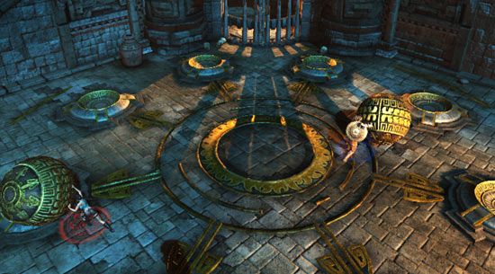
Anyone who has sat bewildered in front of their television for a half an hour of Lara Croft trying to figure out how to advance the game, should just about now be recognizing the scene. When you pull off the various layers of representation of bodacious ponytailed scientists in dark caves with molten lava, waterfalls, rock formations and dynamite, the player is essentially looking at the same complex interrelation of true/false boolean variables that we were looking at when structuring our code. In other words, a Lara Croft game is just a series of interrelated true/false switches that the player has to enact in the right combination in order to unlock a new series of true/false switches.
##########################################################################
# RSG-SMB-TAB-1.1                                                        #
##########################################################################

How to Win "Super Mario Bros"                Nintendo Entertainment System

WORLD 1 - LEVEL 1

                               +----------------------------------+
  Key:     < = Left            |                                  |
           > = Right           |    ^                             |
           ^ = Up              |   <    >                   O   O   |
           v = Down            |    v    select  start     B   A  |
           B = B button        |                                  |
           A = A button        +----------------------------------+

< ------------------------------------------------------------------------
> OOOOOOOOOOOOOOOOOOOOOOOOOOOOOOOOOOOOOOOOOOOOOOOOOOOOOOOOOOOOOOOOOOOOOOOO
^ ------------------------------------------------------------------------
v ------------------------------------------------------------------------
B --------------------------OOOOOOOOOOOOOOOOOOOOOOOOOOOOOOOOOOOOOOOOOOOOOO
A ------------------------------------------------------------------------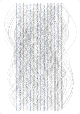

In Alex Galloway’s How to Win Super Mario, a listing of left/right/up/down/a/b button combinations are printed out in text files organized by chapter (“World 1-1”, “World 1-2”, “World 1-3”, …). If these “how to play Super Mario” instructions look just as obscure as artist Ben Fry’s Dismap visualization of the Super Mario Bros. code itself, it is precisely because in many ways the two forms (gameplay vs. game code) are simply different forms of representation of the same algorithmic substrate. In order to play a game, we need to understand something about the algorithmic, and even machinic, structure of how the game was constructed. Playing a game requires a certain process of exploring the game code in reverse, reading it on the player’s end of the equation via the render engine, even if the player knows little to nothing about how pointers, variables, and if/then structures work. But from a purely experiential/intuitive perspective from within the game, the successful player of Super Mario knows exactly how these very-same structures work in order to actually play the game.
////
The principle criticism of back-in-the-day text adventures (circa 1977-) was the tedium of this logic of interrelated boolean switches the player had to unlock in order to advance in the game: open mailbox, get letter, open letter, read letter, drop letter, close mailbox, go north, look, pick up shovel, dig hole, get gun, shoot self in head.
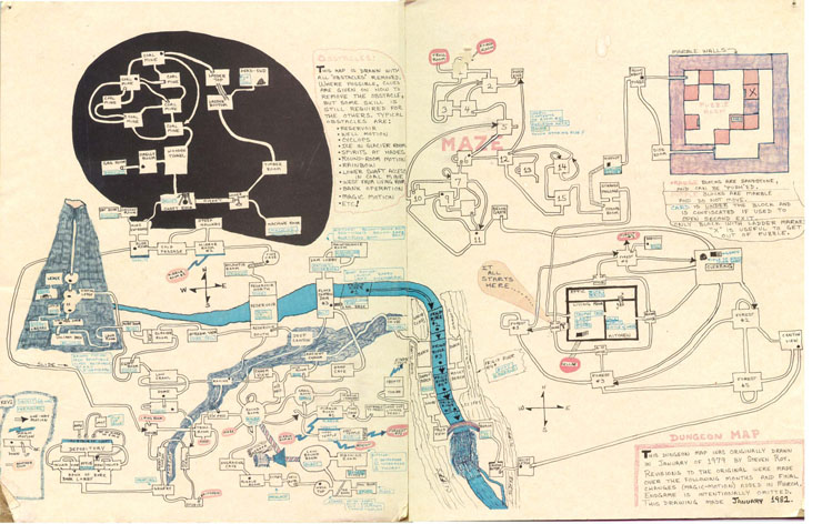
Here is a map from the first commercial textual adventure game hit, “Dungeon” (later renamed to “Zork”), where we can see the complex interrelations of one room to the next and the objects they contained:
— Click for hi-res: Dungeon Map, by Stephen Rost, taken from “You May Be Eaten By a Grue”
In order to play the game, players had to map out all these interrelated rooms along with the objects they contained and discover how they were all interconnected. While the unwrapping of this maze/puzzle could indeed lead to storytelling (“It is pitch black. You are likely to be eaten by a grue.” - cf. Grue), for the most part the player was simply trying to poke their way around a hopelessly complex maze and find the right combination of non-sequitur commands.
From the documentary, Get Lamp: The Text Adventure Documentary, interactive fiction writer Dan Shiovitz:
“It’s like, you ring a bell and kick a dog a bunch of times, and it starts crying after you ring a bell a couple of times.”
While Shiovitz was originally criticizing the absurdity of mazes in interactive fiction, his description is equally apt in describing the absurdity of interactive narrative at its most basic level. Most of the time, the author as well as player are simply trying to unlock a series of boolean switches in the right combination, in order to advance to the next chapter of the story, i.e. the next set of boolean switches in the code. While puzzles are interesting in and of themselves, and can indeed contain interesting opportunities for storytelling, in the case of interactive narratives we seem more to be playing with the machinic structure that made the story possible, than the story itself.
////
Most interactive storytelling, whether it be in the form of a 3D first-person shooter or a 2D sprite-based platformer, evolves directly out of the data structures originally designed by Will Crowther as Colossal Cave Adventure. This original “Adventure” was based on a map of a real cave, the Mammoth Cave system of Kentucky. Crowther’s idea was to equate each item of data to another data item via a spatial relationship: item “a” is connected to item “b” via the command “north”, which in turn is connected to item “c” when item “d” is present at item “b”. By using the real cave as a map for the data, he was able to create potential walkways that players could use to move from one datapoint to the next as if traversing the successive grottos within the cave system. It was essentially a representation for navigating a datafield, much like the Mac Finder or Windows Explorer offers their own representation via folders and subfolders. By situating data items as points on a map, one could move around the data as if moving around in space. It was upon this foundation, using data points as map points and placing narrative excerpts at each data point, that contemporary interactive narrative was built.
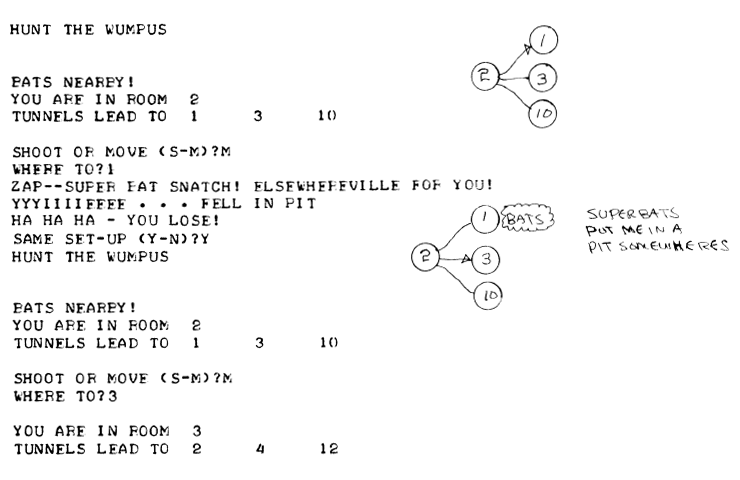
From this idea we get text adventures, such as Zork, point-and-click adventures such as Day of the Tentacle, maze-monster first-person-shooters of the Doom/Quake variety, and more poetic propositions such as the Zelda series of adventures, or Ico. While many of these games contain story, character, landscape, dialogue and all sorts of choices and actions that must be enacted to evolve the narrative, they are still fundamentally structured around finding the location of the next switch that will lead to a new series of switches. At the beginning of the game “Ico”, the player must first climb up a series of ladders, find the right windows to climb out of the castle and then back in again, enabling safe passage to a platform close enough to jump onto a cage that will then lower a trapped girl to the first floor where she can safely exit. Once all of these tedious tasks have unravelled, some dialogue ensues, and the story moves on to the next task at hand which is also the next piece of narrative cue. Unfortunately, from a purely literary perspective, such pulling of levers and pushing of switches embodies all the poetic charm and substance of searching for a missing hardware driver buried deep within an external hard disk.
////
*Spoiler reminder: stop reading this if you haven’t played any of these games.
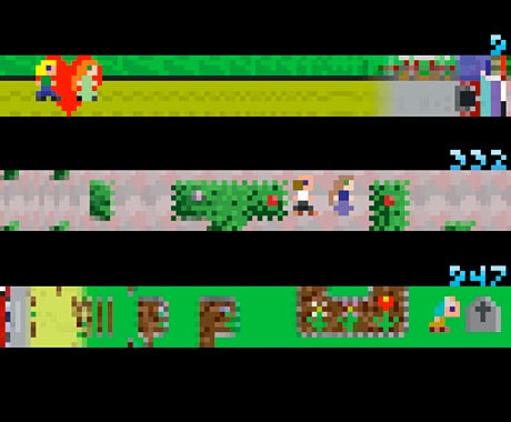
The beauty of Passage, The Graveyard and now Journey, is that none of this peeking and poking matters any more. Passage truly began the trend with a powerful opening volley: here is a game in which you will lead a character to his death. And while this goal is not explicit at the beginning of the game, it is part of the beauty of realization that takes you over when playing the game. When demonstrating the game last week to the Media Design students, one of them — upon realizing the fatality (note that I did not use the term “futility”) of the game as the player starts balding and slowing down his gait —, exclaimed “c’est horrible!” His reaction was unambiguously emotional. Teeny pixelated graphics with a dorky 8-bit retro soundtrack, and yet a game can still evoke a sentiment of inevitability. It’s just a funky little pixelated representation on a screen, nevertheless “c’est horrible!”
Journey follows this formula fairly closely, to such a degree that I wonder in what way the former influenced the later. If so, it certainly would be a nice touch. We know through interviews with Journey’s central designer, Jenova Chen, that he definitely is looking at fellow games and gaming history with an informed eye, but so far I have yet to see a direct causal relation.
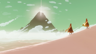
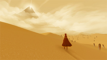
Whatever the case, Journey is very much a similar affair. At the beginning of the game we are simply a voyager who picks up a scarf in the desert. In the distance, framed in a sweep of the camera straight out of that pivotal desert scene in Indiana Jones: a mountain beckons us, clearly inspired by aforementioned Hollywood classics, but almost certainly as well the Mount Fuji woodblock prints by Hokusai.
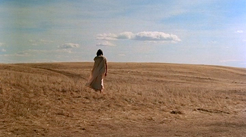
The landscape is gorgeous, the simulation of the sand beneath your feet subtle and totally pleasing; we are experiencing an aesthetic audiovisual convergence reminiscent of grandiose cinematography on the scale of Nestor Almendros in Days of Heaven or Caleb Deschanel in Black Stallion (we’ll still have to wait for rendering shaders on the level of Sven Nykvist on The Sacrifice, but I am now hopeful).
Unsurprisingly, all of this subtle and-yet spectacular beauty takes place within a highly stylized rendering queue. I say unsurprisingly because it is only in embracing the artificial nature of the image construction that 3D simulation will find its way. We are clearly in the realm of animation, illustration even, and far from the realistic renderings that occupy more and more of the gazillion-dollar 3D shooter blockbusters currently on sale for $75 at your local supermarket. Perhaps, and this might be due to the algorithmic nature of the image, my cinematographic references should instead be harking back to the history of animation, and not live action. For it looks as if we are inching ever closer to the visual plasticity of a Brothers Quay production, à la The Comb or The Piano Tuner of Earthquakes. Again, not quite, not even close, but one can always hope.
From this luscious tableau, we begin our journey from desert to mountain. The sophistication-in-simplicity argument comes from the translation of Passage’s 2D left-to-right narrative mechanics into Journey’s 3D near-to-far construction: the next “goal”, which is more the next “step” on your path, is often a barely perceptible building or outlying natural structure that acts as a beacon leading you forward. Amazingly, the mountain itself acts like a character in the story, through mere shifts in lighting and humidity levels which interact thematically with the evolving storyline and landscape to evoke different “moods” as we progress: at first ominous, then distant, ethereal, massive, brooding, violent, festive, and ultimately, ambiguous.
////
I won’t linger any further into the journey itself because it is not really important to what is, I hope, shaping into my central thesis: namely that by removing the tedious goal posts as the motivating factor of a game and replacing it specifically (and quite explicitly given the title itself of the game) into the space in-between — i.e. into that aesthetic field where the gameplay can unfold —, the game designers have further evolved a narrative language that was originally suggested by Colossal Cave Adventure, re-articulated in Super Mario Bros. and then Zelda, and finally brought into the more literary realm of figure and metaphor via Passage.
////
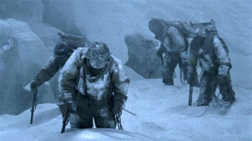
One of my favorite cinema sequences comes from the third chapter of Akira Kurosawa’s end-of-career tone poem, “Dreams”. The dream is entitled The Blizzard and depicts a group of exhausted explorers climbing a mountain ridge in a snowstorm, haggard, nearly extinguished, and clasping to their last breaths. The scene is interminable, and often shot with a telephoto lens from the side so as to further flatten their gasping faces into the underexposed terrain that visually engulfs them. All we hear are their panting breaths, and eventually their complaints amongst one another. No back-story, no character motivation, just the sound of desperate breathing and a vague image of faces dragging their bodies through the blizzard.
There is a moment near the end of Journey (although not quite at the end), when two voyagers, ours and the voyager accompanying us, are similarly pulling our heavy bodies up a snow-covered mountain. Our gait is troubled, weighed down by fatigue. We carry on, ever more laboriously, into the headwind. Eventually our body gives out, the controls disconnect from our persona who keels over, face-first, into the snow. It is a moment of inevitability, of loss of control, and yet everything about the scene feels just right. It is progressively clear to the player what is about to happen and yet we advance into the snow nevertheless, resigned to whatever the narrative is holding out for us. In a medium that tends to prize interactive mastery above all else, this loss of control from within the interactive realm comes as a refreshing relief. This is not some pre-rendered cut-scene superimposed into an interactive fiction; this is the interactivity itself leading to its own extinction as a sort of accomplishment. Exhausting gameplay.
////
The second time I played through Journey, I was lucky enough to experience a lovely little poetic moment right at the end the game, as the two travelers approach the abyss. For those that have played the game (*at this point, it’s your problem if you have never played Journey and have herein spoiled any future experience of it), you will know that by pressing one of the buttons you can make a little melodic chirping sound, allowing you to communicate via very rudimentary means with your fellow traveller. So it was precisely at this point, just before the abyss engulfed us, that my fellow traveller and I decided to stop, not at first but eventually, in a back and forth choreography of following each other’s lead. At some point, we both simply decided to stop, just standing there before the abyss, the obvious ending point of the game. We had already travelled to this point and given that the game is cumulative, much like Passage, there is no real going back, even if one would want to. So in order to prolong the experience and simply take it in, we both at some point, through subtle character body-language, decided to just stop. At that point ensued several minutes of dialogue:
“Piou piou?”
“Piou piou.”
“Piou piou piou?”
“Piou.”
While I generally try to avoid cinematographic analogies when speaking of gaming (I in fact loathe such uniformed discourse), at this point I’m so guilty of hyperbole that I might as well just suck it up and give in to the impulse: the moment was damn cinematographic, despite the obvious cheesy cliche-ness of it all. The experience just worked, and on an emotional level rare for me when playing a video game. It was an experience which I have only previously known through now canonic, well-worn aesthetic forms such as music, literature, painting, illustration, photography or cinema.
////
Popular rhetoric, even within the video game community, gives great weight to the notion of “choice” in interactive narrative, as if choose-your-own adventure texts had somehow given us a heretofore unexploited key to some future form, despite the fact that no one seems to be interested any longer in the format.
Maybe it is just because we haven’t tried enough angles. Perhaps. Count me in on trying all those other angles, and this is in fact precisely what we are trying to do at Media Design and at the Atelier Hypermédia. Some of the experiments students are trying out in this direction are profoundly exciting, in spite of all my doubts.
And I do not doubt that there is indeed something yet-to-be-discovered in branching narratives, but in my opinion we are “digging in the wrong place” if we think that choice (more of it, better choices, etc) is going to enrich our experience of interactive narrative. I do not doubt the intent of games like Mass Effect, which prolong players choices all the way through three super-productions, taking the risk of alienating their players at the end of the game as they try to resolve an infinite series of narrative threads. I wouldn’t know anyway, I have’t even played the game, my students have. But given that the apparent solution to their dilemma is to pull out a Deus ex machina (cf. On the Media, New Endings) à la “it was all just a dream”, I figure my long polished reticence on this subject (15-years and counting) is still well founded.
To further flog the comparison-with-cinema horse, Robert Altman never felt the need to wrap all his intersecting narratives into a tight little package.
////
In the novel and subsequent film “Sophie’s Choice”, there is indeed a scene involving a profound choice that a woman has to make in order to save her child. And while this choice is indeed harrowing enough to be recounted and still retain something of its power, it is ultimately in the pregnant pauses between the lines that the true force of this choice is felt in the narrative realm. In the film rendition, it is on the infinite white screen of Meryl Streep’s face that we project all the horrors of her unbearable choice. The context of the choice itself is merely the frame upon which this face hangs. This we have known ever since the days of Lillian Gish in The Wind or Renée Falconetti in La Passion de Jeanne d’Arc. More recent film-makers understand this perfectly as well, for example Quentin Tarantino in the “La Louisianne” scene of Inglorious Basterds: we know going into the scene what the stakes are, and most of all we understand the strategic details of the narrative plot (underground bar, offset alcove with an eavesdropping nazi, etc); it is ultimately the dialogue as they intersect the faces, the how and not the why, the adverb and not the verb, that unpacks layer by layer the tension of the 25-minute scene. The whole thing is harrowing and entirely bad-ass, two descriptors that gamers would love to use to describe their games, and yet the entire weight of the scene hangs in the balance of the length of an vocal inflection.
Lillian Gish, The Wind, 1928; via Bouchards
Unfortunately for gaming — at least for the time being —, there is no equivalent to the face of Lillian Gish, especially when it comes to 3D attempts at realism such as Call Of Duty. Everything must be constructed by hand or through code. Motion-capture isn’t there yet, just watch any recent hollywood film. As a result, games are currently relegated to wide or medium shots of battle scenes, or over-the-shoulder renderings such as in Gears of War.
While photography, too, was a originally an affair of landscape before moving in to portraiture, photography nevertheless has a natural relationship with the real, a relationship that algorithmic machines have not yet developed with the physical world and the bodies that inhabit them.
////
Given these limitations, I find it encouraging that a new generation of game designers are beginning to experiment with the form of gaming on a level not only of narrative complexity, but also of narrative subtlety, perhaps even maturity. We obviously still find ourselves in a significant dichotomy between the games sitting on big-name physical/digital store shelves, and the more independent/auteur fare that often has to play the distribution game at the margins, via Flash-based websites, etc. But this has always been the case with previous media forms. Solutions are out there and the landscape is currently shifting anyway.
Most importantly, it would seem the new generation wants to attack the issue of a more diverse narrative language in gaming. And while death seems to be one of the easier targets, it has been a central trope of the medium since nearly its origins, so why not. In any case, it unambiguously shifts the focus of the game back into the aesthetic and emotional experience of play. By removing all the goals, and keys, and puzzles to unlock, we settle in to a type of narrative where wider themes can be explored.
Case in point, a recent exchange between Brooke Gladstone and Sebastian Janisz on the excellent On The Media:
— BG: Your game was about depression, and this was the game that for me most fulfilled the goal, if that was your goal, to summon-up what it feels like to be depressed. There is the metaphor of beating your head against the wall. The second you get through to a new place, the same arduous process of beating your head against the wall begins again, or beating your head against various objects with little, very minor, spatters of blood, lest you forget that this is painful. And the whole thing feels very lonely.
— SJ: Thank you. That really sounds a lot like what I would have hoped someone might get out of the game.
— BG: You picture your own death. Or did I just… Spoiler alert!
Personal Video Games, On The Media, March 30, 2012
////
For another reading of Journey, try Ian Bogost’s Portrait of the Artist as a Game Studio

